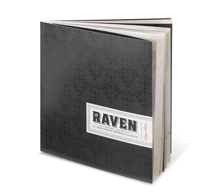
Suppressing my pride, I handed over the small, ornate book to my mother.
“How nice,” she said. “Now, which part did you create? The illustrations? The pattern? The font?”
“No, Mom. I was the art director.”
“Oh. So what exactly did you do?”

People ask me this question often — in the same puzzled, almost suspicious tone — and I can understand why. Most of us see creativity as an act of individual production, one that belongs to the creator alone.
But being an art director isn’t like playing the violin — it’s more like conducting an entire orchestra. So in the same way we might see the person on stage waving her arms around and wonder, What exactly is she doing up there?, we say to the art director: If you didn’t draw the illustrations or take the photographs or write the copy, what exactly did you do?
Underneath that question lies another, unspoken one: Why does it matter?
Milton Glaser, one of the world’s legendary art directors, borrows from the Roman poet Horace for his summation of art’s purpose: “to inform and delight.”
All of us are inundated by media, so art directors aim to create work that’s both engaging and distinct. Especially in our clickbait age, a catchy title may help draw a reader to a story, however — especially in the world of print — the visuals are often what first elicit attention. It’s how we’re wired. The human parasympathetic nervous system immediately responds to aesthetics before the brain can even decipher a story title. Humans instinctively scan their environments looking for distinction as if the world were a newsstand.
Distinct art commands attention. It delights.
Successful art also rewards attention. It informs.
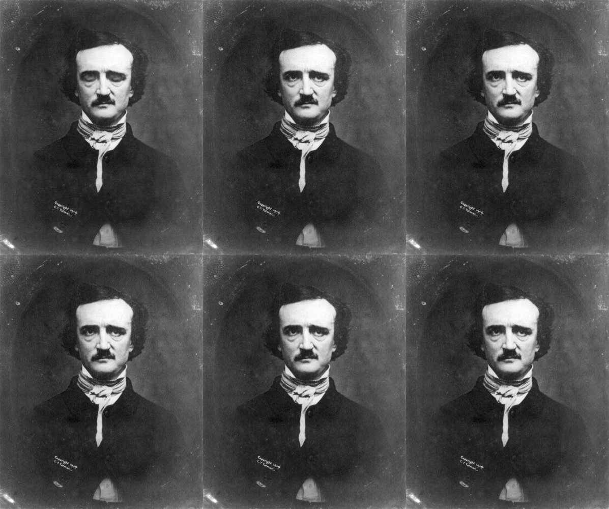
For the past 14 years, I’ve been an art director and designer at Journey Group, an independent design company. The book I showed my mother that day was something we created for the U.S. Postal Service to commemorate the release of an Edgar Allan Poe stamp. This project is now a decade old, but to this day, it’s still one of my favorites. The reason? It was my first foray into art direction.
When the project came to me, my initial inclination was to approach it like a designer — to jump right into the details. What typeface would we use? What about the color palette?
But art directors think differently.
I went to Barnes and Noble to see what other books about Poe might be out there. Most of them were lengthy, generic compendiums that came from large publishing warehouses. I was expecting to see some really strange stuff, but I didn’t. So I set out to create what I was hoping to see.
According to author Steven Heller, an art director must have not only good taste, but also the vision and confidence to act on that taste, to bring their ideas to life. My vision for this book was to make it look like Radiohead sounds. An immersive experience. I would need surprising and original art to set that tone: dark, subversive, surprising and beautiful — like Poe.
In order to realize that vision, I needed to find an artist who wasn’t just knowledgable, but passionate about the subject. While perusing Poe-related art online, I was thrilled to find Emmanuel Polanco, a French collage artist whose work was dark and gritty.
I’ve learned that imparting vision to an artist can be a tedious process, but for this project it was remarkably simple. Two of Emmanuel’s favorite artists? Radiohead and Edgar Allan Poe. Although this was our first collaboration, I immediately trusted him.

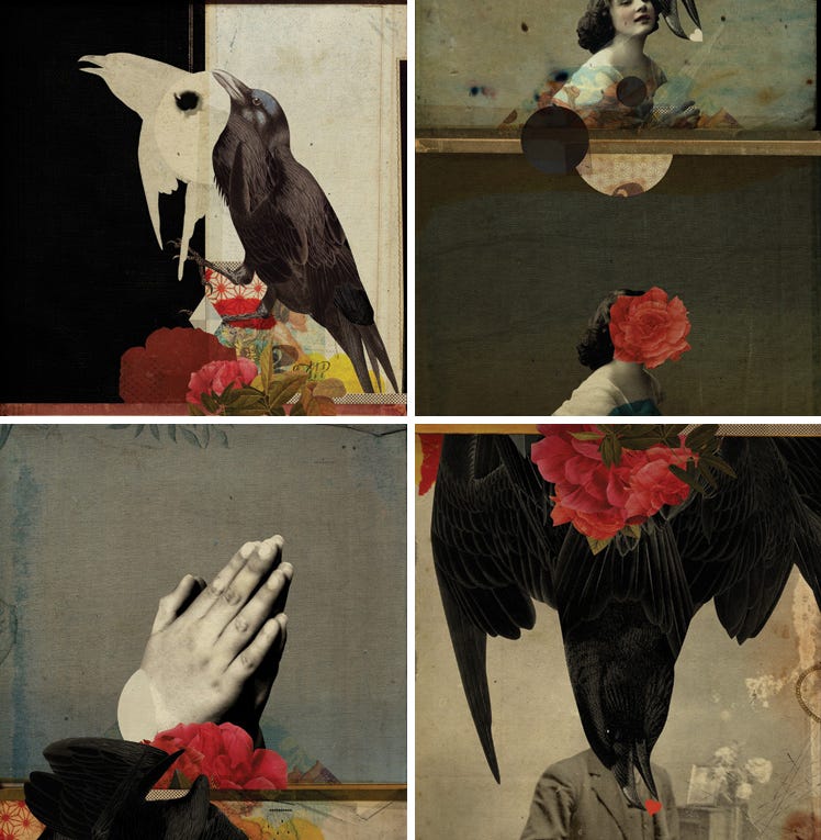
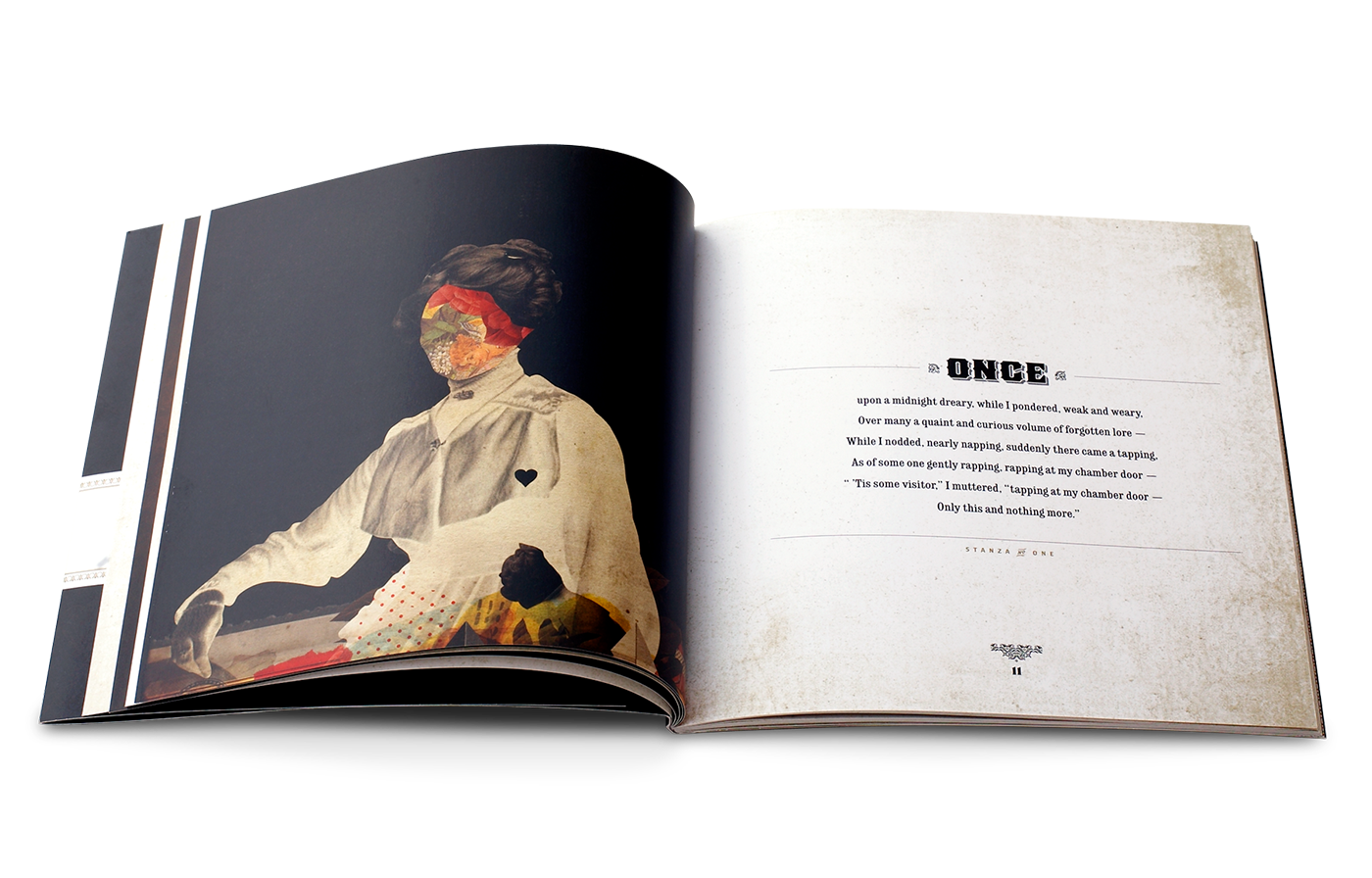
I knew the artwork would be the delightful thing — though “delight” is perhaps too sunny a word for Emmanuel’s style — so my main goal was to encourage him to play. In his multi-layered illustrations, scraps of wallpaper and blood-colored flowers replace the faces of phantasmal figures dressed in Victorian garb. Ravens grasp at the air with reptilian claws or hold tiny hearts pinched in their eerily tweezer-like beaks. The artwork makes the reader pause to interpret the story in each visual; there’s no doubt that it commands attention.
But I also realized that it was important to inform — to reward that attention with a simple, immersive and cohesive reading experience. Rather than selecting a range of excerpts from Poe’s work, I decided to focus solely on one of his most iconic poems: “The Raven.” The pacing and layout of the book became an exercise in restraint: 18 stanzas with lots of breathing room (one per page) and six illustrations nestled throughout. I knew that rhythm was important to Poe, so I created a rhythm of my own — one illustration for every three stanzas. And because the patterns and images Emmanuel used were of the period, I chose typefaces that were available at that time.

Looking back, I realize it would have been easy to recreate one of the books I came across that day in Barnes and Noble, easy to take a bunch of disparate Poe-authored or -related content and throw it all together. And perhaps if I had allowed myself to get caught up in the individual design details at the beginning, I would have. But the young art director took time to wonder, to do the research, to find the right artist, to map out the poem’s flow.
It’s not a quick or easy answer, but that’s the heart of it. That’s what art directors do.
Over the last decade, I’ve continued art directing stamp products, and sometimes even the stamps themselves. Since our company’s founding 26 years ago, the media landscape has changed dramatically, and the need for distinct art direction has grown tenfold. Rather than just one artist, these days I might find myself art directing 15 artists for the stories included in an alumni magazine.
Yet the philosophy is the same. No matter the project, I do my best to approach it like an art director — someone who sees the larger picture and who understands that as people who seek to tell engaging visual stories, we should not only be capturing a viewer’s attention but nourishing it.
We should also seek to break new ground, in every single project. I think what pleased me most about art directing “The Raven” was my sense that Poe himself would have liked what we made. It was as avant-garde as he was. He probably would have been into Radiohead, too.
