When I was a little boy, I’d often walk with my dad over newly plowed fields.
While I obnoxiously threw dirt clods, he’d painstakingly turn over the freshly disturbed earth with a walking stick he’d fashioned out of an old broom handle. We had learned that sometime in the 19th century there had been a Cherokee Indian camp on what is now my grandfather’s land, so he was looking for arrowheads.
We’d visit the farm often, especially in the spring, and it was my dad’s practice to roam the fields accompanied by his impatient and annoying son. Somehow he was able to look past the random lumps of dirt and pick up the glint of the sun off the flint of an arrowhead. Against a backdrop of indiscernible randomness, he could perceive the subtle but intentional markings that make arrowheads so distinctive and beautiful.
Even as a child I marveled at his patience and unwavering eye. And much later, as a design student, I realized that my dad was an unwitting master of the Gestalt principles of perception.
Early in the 20th century psychologists sought to understand the ways humans derive order from the chaotic sensations around them. Through a theory of human perception, they argued that our minds are predisposed to assign meaning to the visual stimuli we encounter every day.
The German word gestalt translates to shape and underscores how these psychologists were fascinated by the ways visual forms influence our perception of meaning. They discovered a set of underlying principles that govern how we see objects — by bringing to each visual encounter a tendency to recognize patterns, group similar elements, and simplify complex stimuli.
The original list of principles was organized into five categories — proximity, similarity, continuity, closure, and figure/ground. It did not take long for graphic designers to embrace the ways this theory of perception could be applied to the work of visual communication. Since my first exposure to these concepts in design school, I have been fascinated by how, unlike most lurid advertising gimmickry, they are quite ordinary within the human experience — they put forth the simple idea that we are inherently motivated to make sense of the world.
The Gestalt Principles of Perception
By way of demonstration, the five categories below offer some insight into the original principles from these Gestalt psychologists as well as how to apply these concepts to visual communication today.
1. Proximity
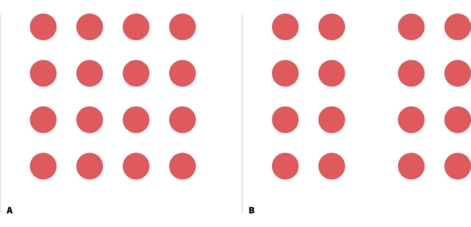
The principle of proximity is essentially about visual relationships — the idea that objects which are closer together appear to be more related than those that are further apart. While at first blush this principle may seem obvious, the power of proximity suggests that we also attach meaning to visual groupings of objects. Even if the objects are significantly different from each other, their spatial orientation holds sway over other glaring similarities such as color, shape, or texture.

2. Similarity
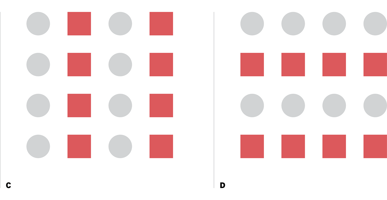
When objects appear to be similar to each other, we tend to group them together and perceive them as having a unified form or message. Although proximity is essentially about visual relationships, the principle of similarity is often demonstrated through color, shape, and pattern.

3. Continuity
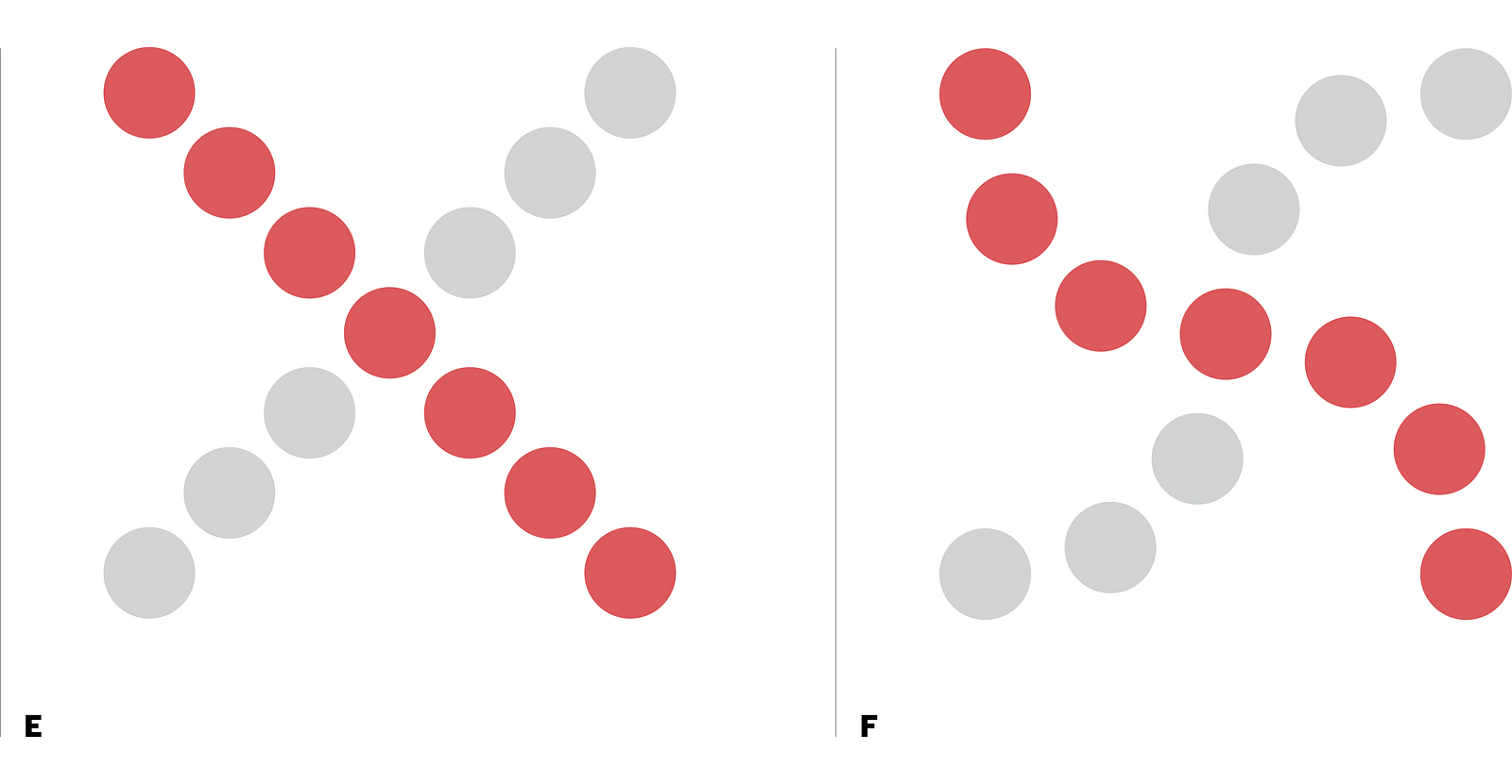
When objects are perceived as moving in the same direction and at the same rate — what is sometimes referred to as optical flow — we are apt to see the suggested movement as part of a continuum. A sense of continuity comes from a grouping of objects that are positioned rhythmically along a path.

4. Closure
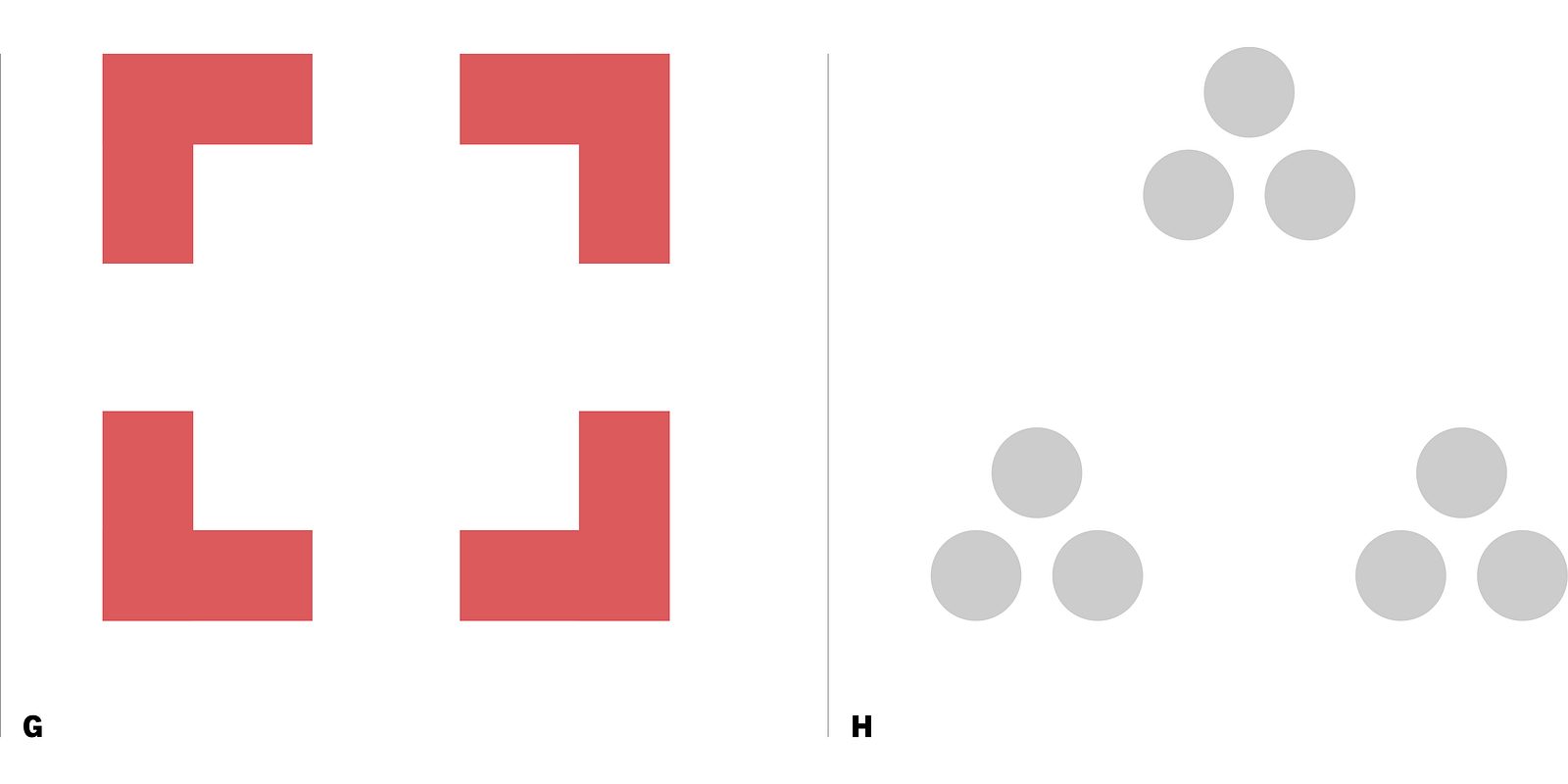
When we look at a complex arrangement of visual elements, we are inclined to simplify the experience — to look for a single and recognizable pattern to fill in the void and complete the shape. Because closed shapes are satisfying and make visual sense, we are drawn to imagine open and incomplete shapes as a discrete whole.

5. Figure / Ground
According to this principle, we tend to segregate visual stimuli into figure and ground. The focus of the visual plane is the figure while the background serves as the ground. Based on the design, however, viewers are inclined to make distinctions between the foreground and background and perceive the relationship between the two as either stable, reversible, or ambiguous.

The whole is greater than the sum of its parts
But why does this matter? Even though their research was conducted over 100 years ago, the Gestalt psychologists still managed to stumble upon patterns of perception that shatter subjectivity and suggest that humans instinctively and consistently search for the larger story. The common maxim The whole is greater than the sum of its parts reinforces and amplifies this idea. That we humans tend to look for patterns among the individual parts toward some cohesive whole is commonplace to our everyday experiences. As a result, the discoveries of the Gestalt psychologists provide insight into visual communication.
What these principles demonstrate is that when viewers engage visual phenomena they are already inclined to construct order and generate meaning. While images are surely subjective, we are inclined — seemingly by intuition — to discover and resolve visual relationships. Anthropologically savvy designers employ the Gestalt principles of perception to more masterfully engage and delight viewers.
These principles also matter, I think, because I now have an exquisite and enviable stockpile of arrowheads, all of which were discovered by a pair of perceptive eyes in a single cornfield in Tennessee.
Look past the surface, literally and figuratively.
