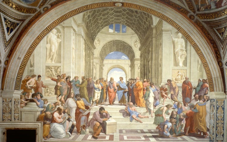
While in Rome some years ago I stood before one of the highest achievements of the Renaissance — The School of Athens by Raphael. I have always admired Raphael, the young and sensuous painter who rivaled Michelangelo.
Commissioned to paint murals within the pope’s private chambers — and just down the hall from where Michelangelo was working on the Sistine Chapel — Raphael painted a depiction of the debate between Plato, with his hand pointed to the sky, and Aristotle, whose hand reaches out.

As I stood somewhat breathless and fully absorbed, with The School of Athens overwhelming an entire wall of the Stanza della Segnatura, my exasperated wife finally found me but was not as enamored with the painting — and much less with me.
From my modest grasp of classical philosophy, Plato points up because he imagines the permeable world around us as just a shadow of a higher, truer reality that is eternal and unchanging. For Plato, this otherworldliness is the ultimate reality and the essence of all truth, goodness, and beauty. Conversely, Aristotle holds his hand down, almost level, because in his philosophy the only reality is the one that we can access by our senses — especially by sight and touch, but also by sound and hearing and taste.
What this painting portrays, among other things beyond my grasp, is the vivid tension between horizontals and verticals as a design principle that works, as when representing philosophic ideas, as metaphor. But horizontals and verticals also work as visual elements to be manipulated in ways that organize content. They are, to my mind, equally important.
To my way of thinking, this design principle is born out of how humans experience the world, offering tangible metaphors from the horizontals and verticals that dominate our everyday lives. Over time, some theorists — like Plato and Aristotle, respectively — have symbolically equated our encounters with verticals as representations of the heavens and the gods, while our horizontal experiences as references to earth and man.
This matters, I think, because design principles that originate from what it means to be human have more innate power to resonate. And that’s where real communication begins.
Because humans relate vertically as autonomous beings in a horizontally suppressed environment, this relationship inspires a universal design principle that is virtually self-evident. And like our experiences with the natural world, the ways horizontals and verticals interact have the opportunity to create either resolution or tension — and often both.
When designing within a visual plane, for instance, the relationship between these visual elements can organize space and content to inform — to present content in ways that are both clear and accessible. This is no more evident than in a simple spreadsheet, where the vertical columns and the horizontal rows work together to sort and present data.
But it’s also true that these same contrasting visual elements can be arranged to create delight — even through dissonance and tension — as seen while driving along a lovely but otherwise predictable landscape only to yield, upon the crest of a hill, a spectacular skyline. Suddenly the horizontal plane is interrupted by majestic verticals that engender the sudden tension of contrast but also some measure of delight in the resolution of what we — perhaps subconsciously — long to see.

To demonstrate this phenomenon within graphic design, one of the best exemplars is the Swiss titan Josef Müller-Brockmann, whose work embodies the International Typographic Style — the influential design movement that served as a kind of confluence of the many tributaries of 20th-century modernism.
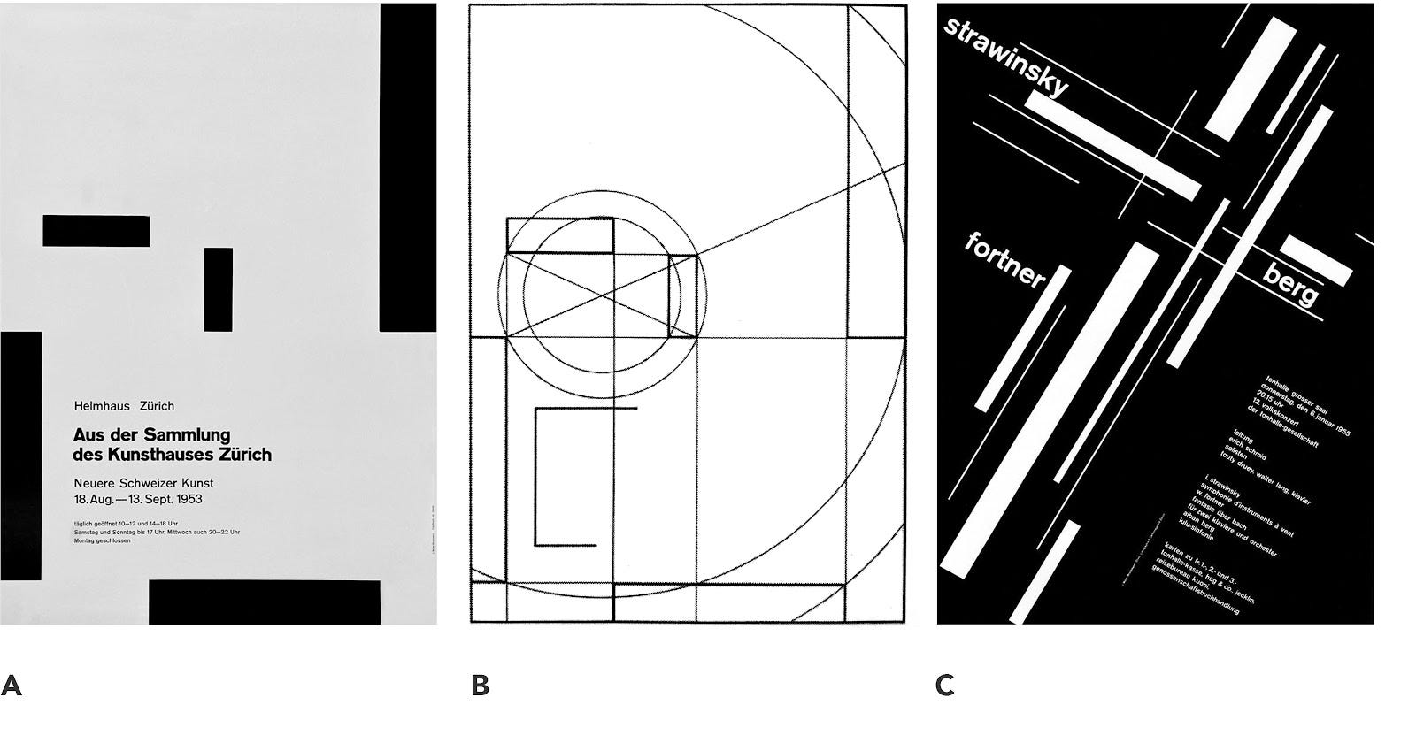
From his substantial body of work, Müller-Brockmann’s many poster designs plainly illustrate this two-in-one design principle. The first — figure A — for an art exhibition in the Kunsthaus Zürich, makes use of very simple but deliberately executed horizontal and vertical blocks to mathematically guide the viewer’s eye toward the substance of the communication. The accompanying sketch — figure B — underscores the care Müller-Brockmann took to systematically organize his design around the content.
Conversely, the second poster — figure C — designed for the Zürich Concert Hall mostly abandons mathematical precision in favor of a lively arrangement of horizontals and verticals in response to the music of Stravinsky. Müller-Brockmann thereby creates a visual metaphor suggestive of Stravinsky’s innovations in both rhythm and harmony. The playful arrangement reinforces an intentionality and boldness that is reflective of the later Serial period of Stravinsky’s work.
“The aim of the poet is to inform or delight, or to combine together, in what he says, both pleasure and applicability to life.”
These two ways of thinking about design principles — as tools for both organizing graphic space and creating visual metaphors — provide us with a foundation for thinking about design broadly, and especially in architecture, graphic design, and digital design. What’s more, these ideas about horizontals and verticals remind us of what it means to be human. All of design — including the visual arts and performing arts and especially music —is born out of our experiences as humans, the unyielding desire we have to make meaning of our world while also submitting to the sublime pleasure of it all.
Whatever it means to inform and delight — to create experiences that satiate us while also challenging us — these human-derived design principles remind us of the formidable responsibility and privilege we have. In a media-saturated landscape seemingly committed to manipulation, we have a higher calling to communication.
It’s a daunting task but one that, I think, is not only doable, but also noble.
