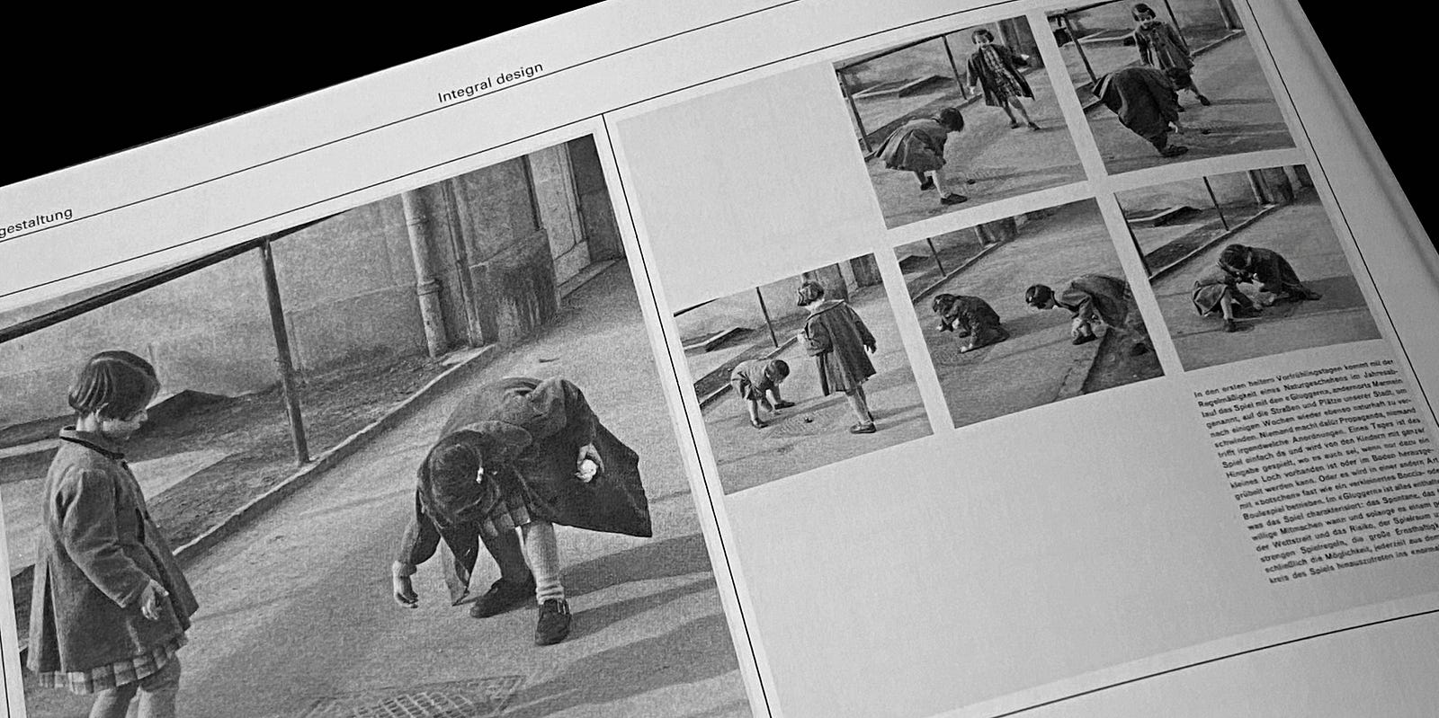
LIKE MOST EVERYONE, as the world cautiously emerges from the pandemic, I wonder how our lives will change. For all our efforts to create meaning and order in the world, it seems chaos and randomness have had their way.
I am reminded of the many ways artists and designers responded to the horrors of World War II. The great utopian ideals of the early 20th century were crushed by war, depression, and despotism. How did artists respond?
As so often happens, life imitates art. The abstract expressionist painter Mark Rothko worried that America would simply go back to pretending that everything was gonna be OK. In 1958, when Rothko was commissioned to paint canvases to adorn the new Four Seasons restaurant in New York City, he saw an opportunity to peel back the curtain, to expose the chaotic depth of humanity’s despair and alienation.
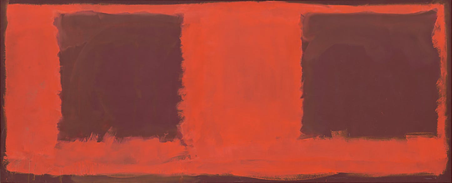
“I hope to ruin the appetite of every son of a bitch who ever eats in that room,” Rothko was quoted as saying. “If the restaurant would refuse to put up my murals, that would be the ultimate compliment. But they won’t. People can stand anything these days.”
Sadly, Rothko was right. Not only did New Yorkers settle into an inebriated complacency, but his paintings also were never displayed in the Four Seasons restaurant. Instead, they were rather comfortably (and beautifully) set aside in the Tate Modern in London.
Order + Clarity
The graphic designers of Switzerland and Germany, however, had a different response from Rothko.
Although the origins of what has been called Swiss Design date back to the 1920s, especially through such earlier modernist ideologies as Constructivism, De Stijl and the Bauhaus, this nascent design movement recognized how the Third Reich subverted the power of graphic design to subjugate the German people. With Adolf Hitler serving as art director, a graphics standard manual was rigorously adopted throughout the party of National Socialism. Perhaps most manipulative were the aesthetic spectacles of political rallies — with light and sound and image — as frighteningly demonstrated in propaganda films like Triumph of the Will.
Given the Nazi abuse of design, the Swiss sought to develop a visual language for graphic design absent of emotion, propaganda, and manipulation. Swiss educators and practitioners taught simplicity, legibility, and objectivity in pursuit of clear and effective communication. Led by Armin Hofmann at the Basel School of Design and Josef Müller-Brockmann at the Zurich School of Arts and Krafts, these design titans “believed sans-serif typography expresses the spirit of a more progressive age and that mathematical grids are the most legible and harmonious means for structuring information.”

Among these prominent designers was Emil Ruder, whose influential book, Typographie: A Manual for Design, became the educational standard of the movement and is still considered a fundamental resource for graphic designers. As a critical reflection on his ideas, he proclaimed, “To design is to plan, to order, to relate, and to control. In short, it opposes all means of disorder and accident.”
This pragmatist dogma of objective design, grounded in order, was believed to provide the antidote to the deceits of advertising design — considered to be the contemporary equivalent of propaganda. But regardless of ideology, this emergent design movement—the International Typographic Style—became the predominant visual language for postwar Europe.
The Influence of Twen Magazine
In the aftermath of World War II, poster design was considered to be the most persuasive means of communication and an everyday occurrence in the mercatos and marchés across Europe. And while most cobblestoned marketplaces continue to display poster kiosks today, it has been the Swiss influence on magazine design that endures. Both print and digital magazines rely on underlying grids to organize content and visual contrast through imagery, color, and white space.
One of the early and best exemplars of the Swiss influence on magazine design is Twen. First published in 1959, Twen was a German magazine for “people in their twenties” but especially young women whose voices were beginning to be heard in the turbulent 1960s. With provocative content, daring imagery, and groundbreaking design, Twen became one of the most influential magazines across Europe.
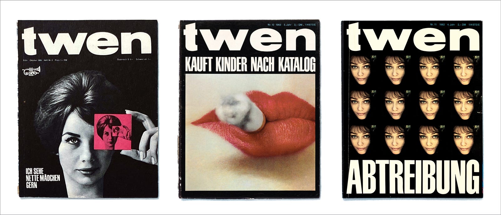
The art director for Twen was Willy Fleckhaus (1925–1983), whose work as a journalist inspired his love for magazines and his belief in visual storytelling. Though he never received formal training in design, the snowballing influence of the Swiss shaped his approach to publication design. His magazine layouts were canvases of white space, with content presented cleanly but punctuated with unconventional photography. As he cultivated relationships with the best photographers in Europe, he became a master of scale and contrast. Fleckhaus cropped photographs tightly and presented them boldly to seize attention from his readers.
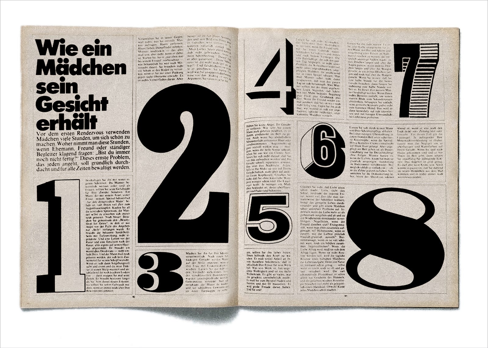
Fleckhaus was rigorously committed to an underlying 12-column grid that provided both departments and features an enormous amount of flexibility without compromising visual coherence. In the layout above, Fleckhaus manipulated the 12-column grid into pages with four text columns each. He created graphic numerals in a variety of sizes and styles to provide an enticing rhythm and contrast across the spread.
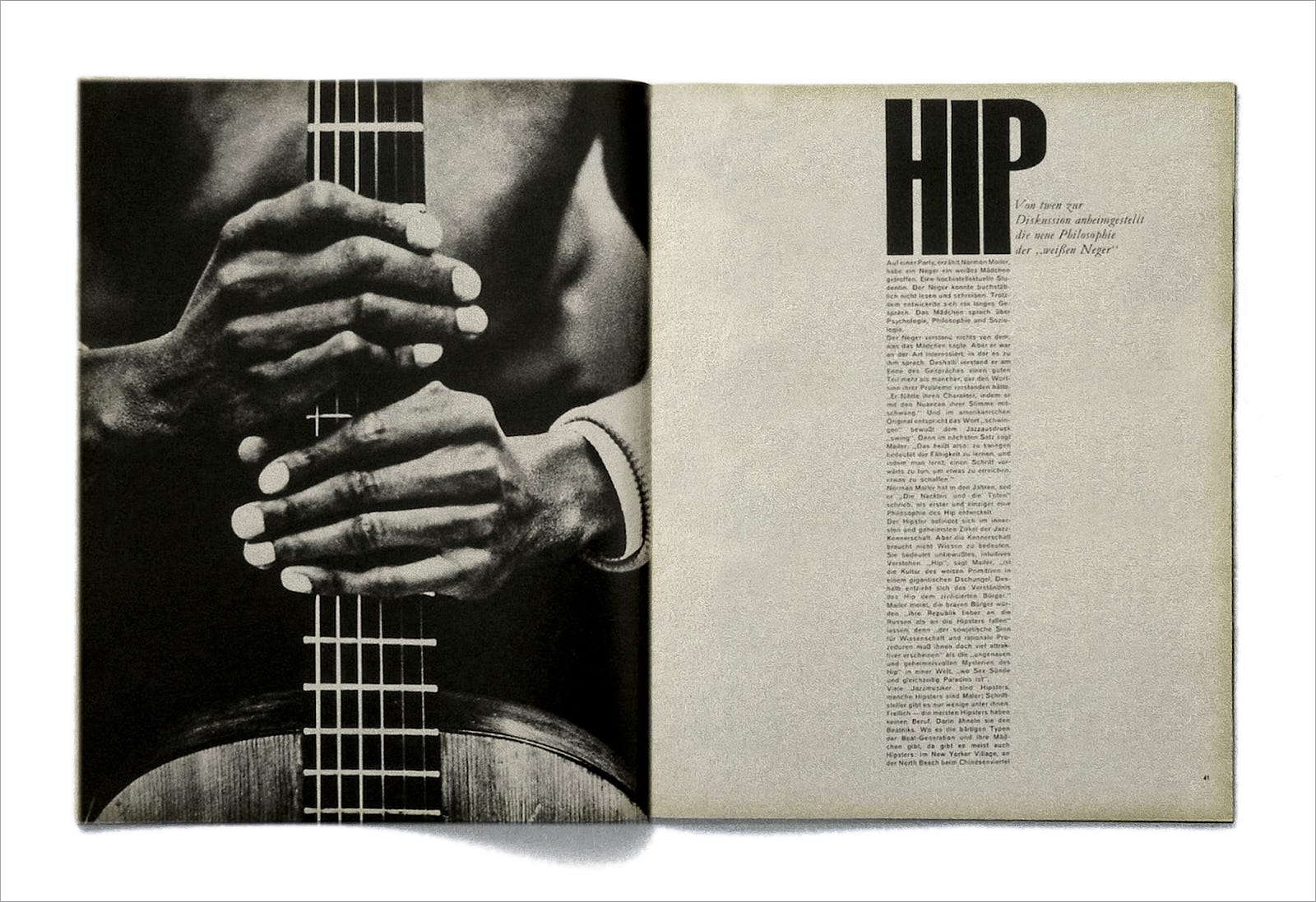
The careful adherence to his grid, however, did not inhibit Willy Fleckhaus from creating fresh layout design. Rather, he embraced grid constraints as a means of generating new ideas—especially in response to powerful photography. In this layout, the visual relationship between the guitar fret and vertical column of type (shown above) is both striking and satisfying.
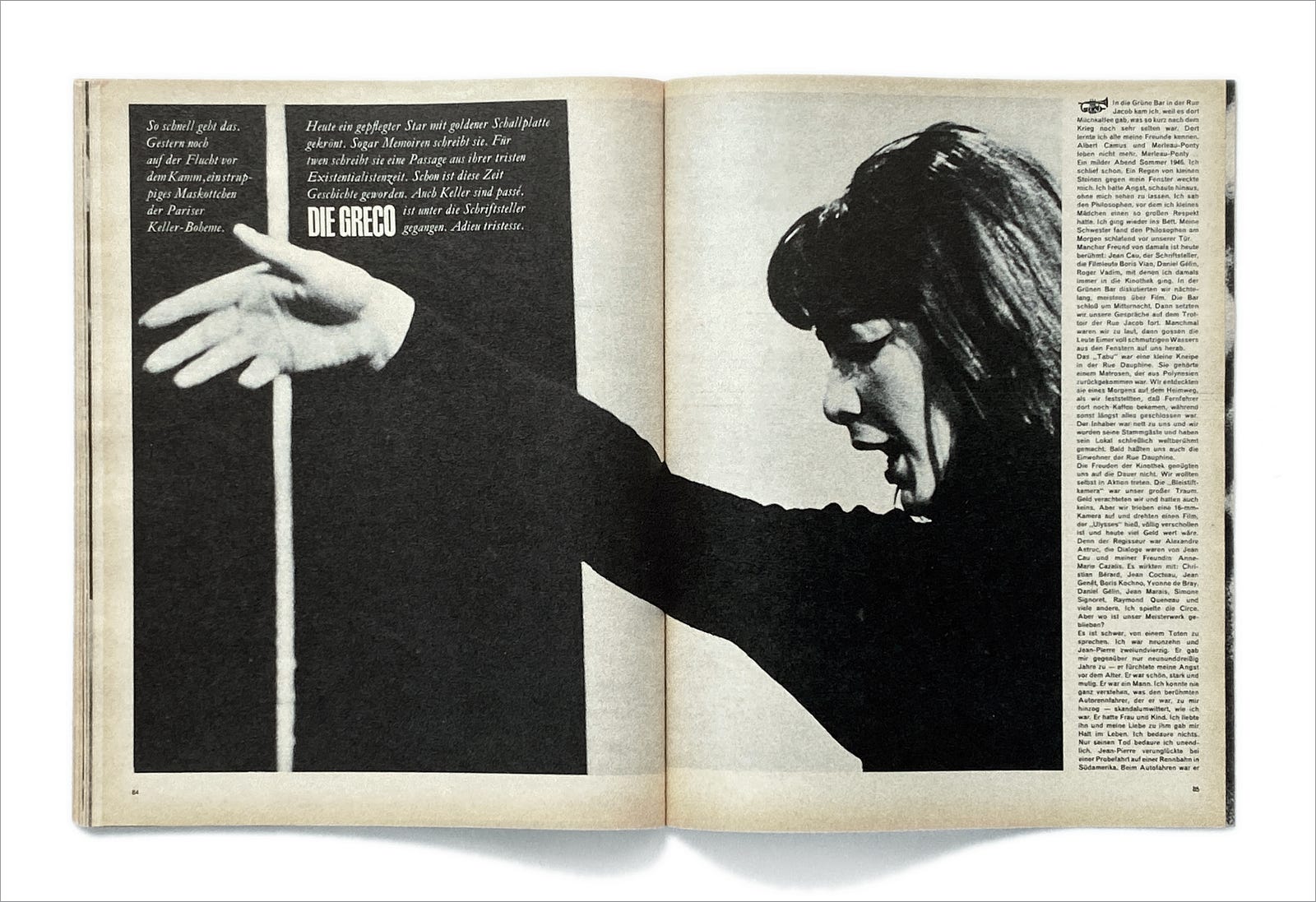
In this photographic portrait, the subject’s hand crosses over a white vertical line. What might have been a distracting intersection gave Fleckhaus the opportunity to crop the image imaginatively. The dominant vertical line now serves to create a vertical black shape that reflects the column of typography on the opposite page.
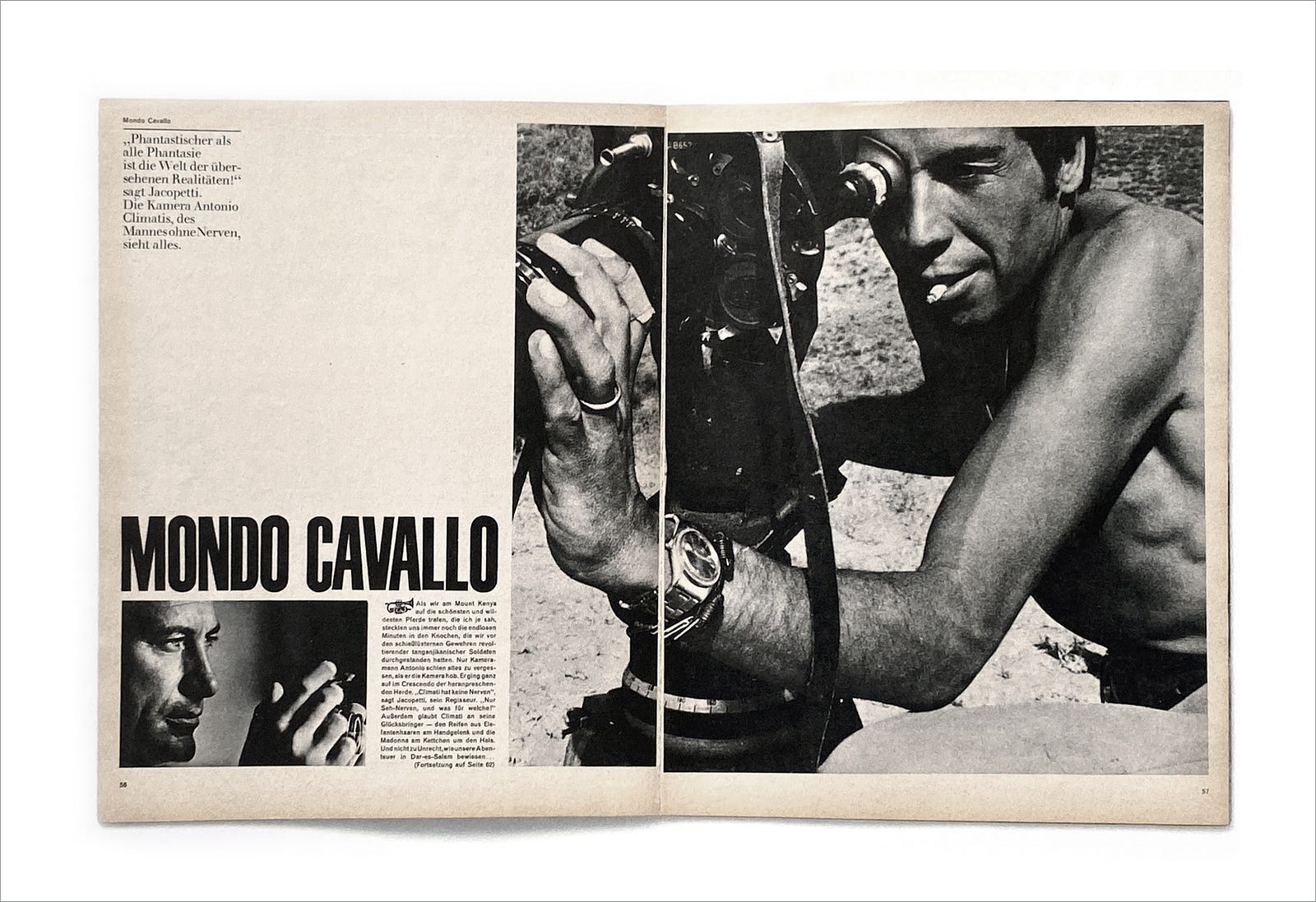
During the 1960s, Twen built an impressive reputation for powerful and evocative imagery and, as this spread demonstrates, often employed the storytelling power of photojournalism. Even here, Fleckhaus confines his images to the grid but makes use of white space to create a sense of drama. The orderly and spacious layout fosters the impact of the images.
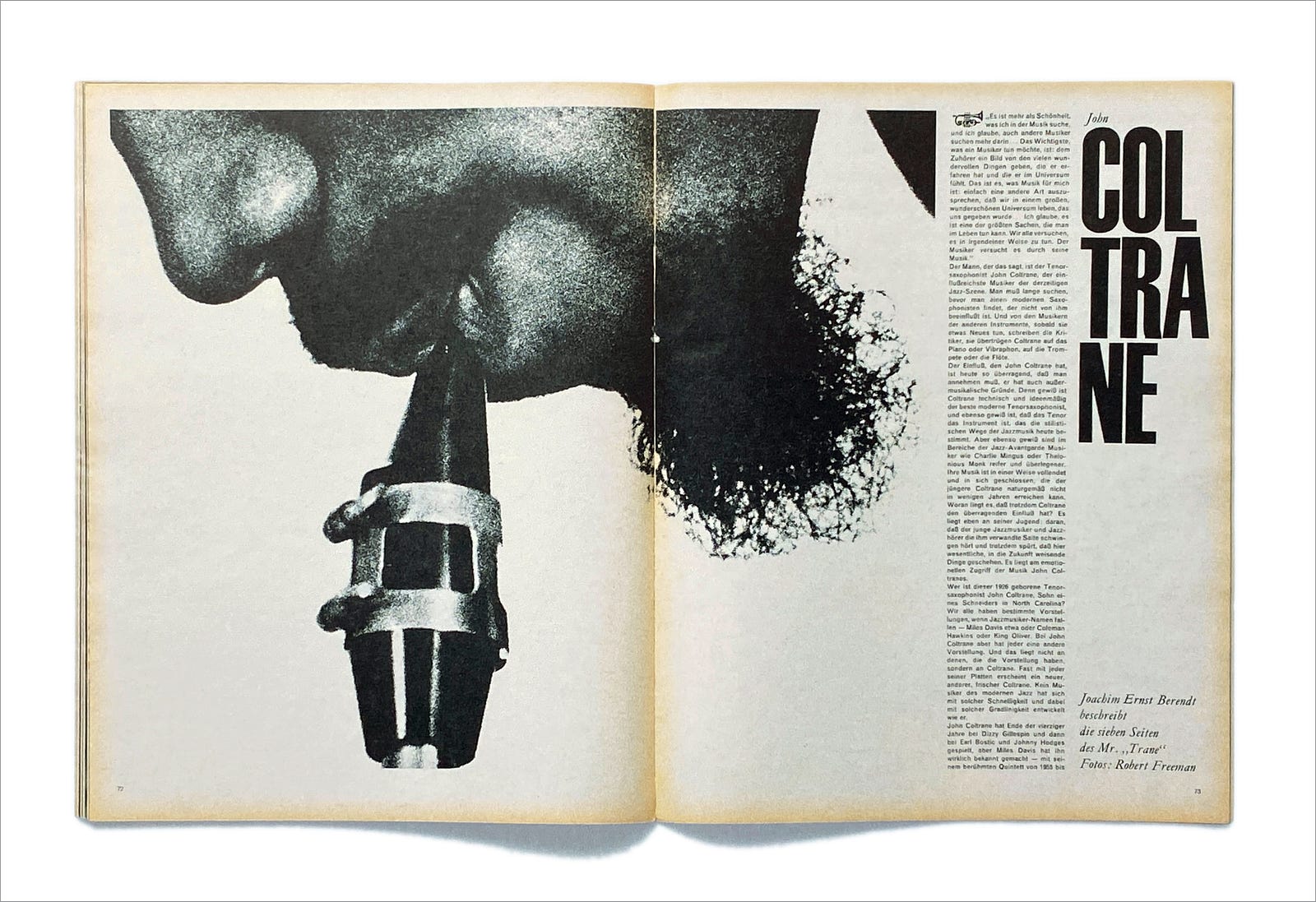
There are very few actual characters in Fleckhaus’s visual dramas. There is the content, of course, along with typography and photography. But white space stands alongside the other characters, perhaps in a supporting role, but important, nonetheless. White space is that fundamental to the design. This spread is a paragon of how Fleckhaus made use of white space to engage readers. The portrait is of John Coltrane, the brilliant jazz musician, but the cropping and position are startling as well as stunning. The white space brings the drama to life.
Embracing Order and Facing Chaos
In truth, my long love affair with Swiss Design has been less about the vitality of the movement and much more similar to ordinary confirmation bias. All humans search for meaning, but I have been predisposed since childhood to make some visual sense of the world.
Only a few weeks ago I took some time off of work to clean out our attic and garage. Our children have left home, along with the refuse of their college years. The countless trips to recycling and the reordering of our storage space was actually life-giving to me. Now that it has been organized, I have placed a chair in my attic where I can simply sit and enjoy the beauteous order of it all.
So it’s no surprise that I have been an eager apprentice of Swiss Design since I first began studying graphic design. I have long enjoyed bringing together the disparate elements of content and form toward some cohesive whole—hopefully bringing clarity to visual communication. This approach has served me well, especially in my work as a magazine art director, where I have emulated great publications like Twen.
And yet, I wish it were that simple.
Although my design education was formed by the Swiss of the 60s, it was while working as a practitioner in the 90s that those sensibilities were turned upside down. While so very much of design is about creating order and clarity, it is also true that we humans live in a chaotic world. Not only have we learned to live with the mess — see my former attic — but we’ve become adept at holding the chaos at bay, so much so that we are drawn to the disorder. The pandemic has revealed what artists have always known: The world is vulnerable to chaos even while we blithely try to tidy up our lives.
In my next essay, I’ll introduce a couple of other publications that built on the order of the Swiss but embraced chaos in ways that were sometimes shocking but always stunning. Chaos, no doubt, can be alluring.
As for Mark Rothko, sadly, his over-realized awareness of chaos caused him much despair. Perhaps there is a better way.
“After the monstrosity of the war, what do we do? What is there to paint? We have to start all over again.”
