IT IS THE SUMMER OF 2021, and while I should be stepping back out into the sunshine, I find myself thumbing through back issues of Ray Gun magazine. One might think I’ve had enough chaos during the pandemic, but I’m trying to remember the kind of beauty that can only be found amidst the rubble and ruin.
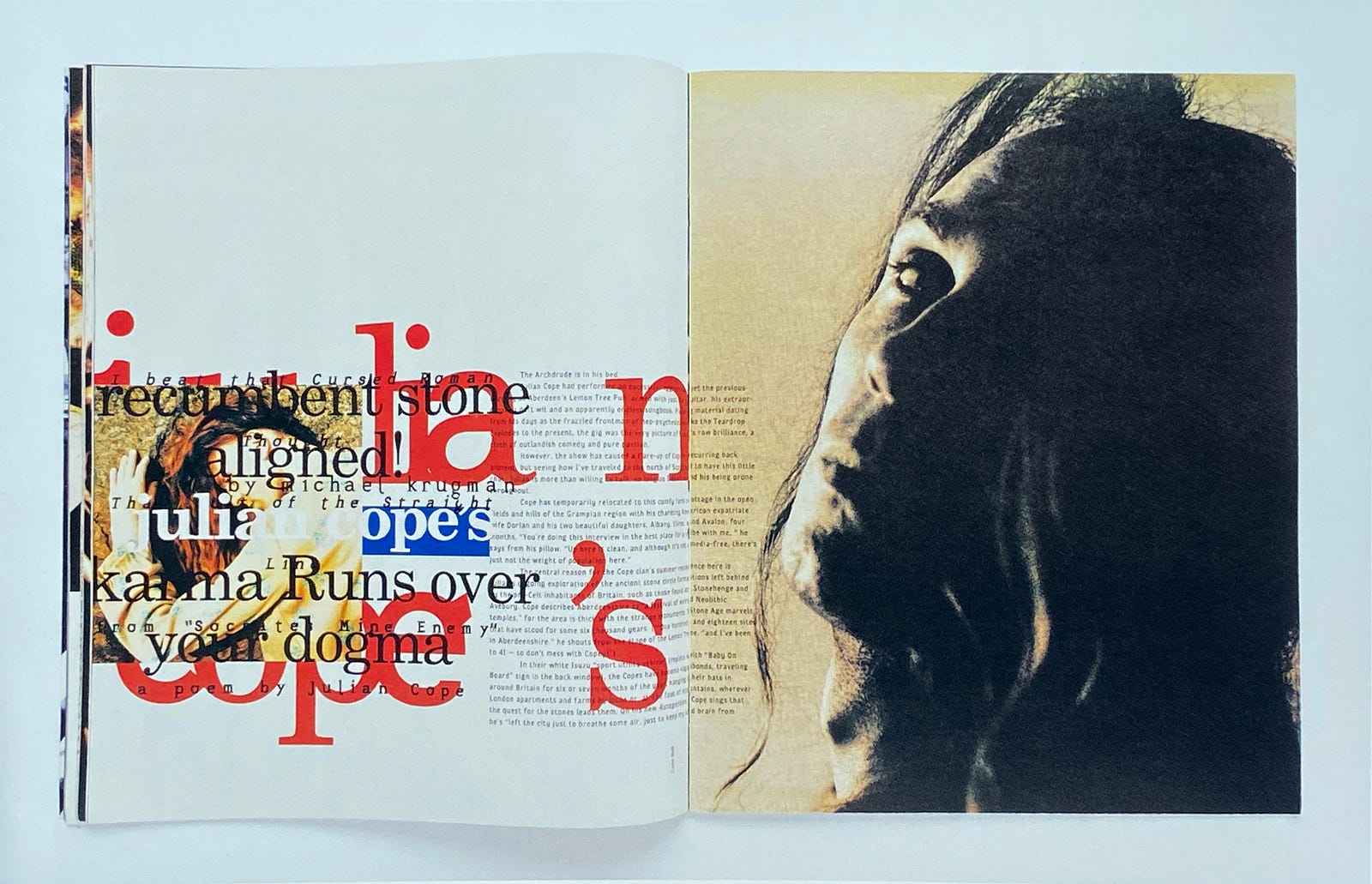
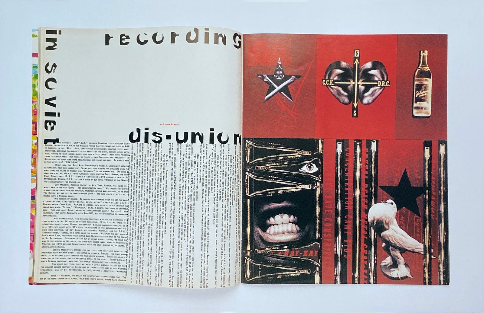
First published in 1992, Ray Gun magazine was emblematic of the emergent grunge rock scene and, to graphic designers, became a visual totem for alternative typography and design. The designer David Carson — who has since become a design legend — created magazine layouts that were sometimes visually assaulting but always stunning and irresistible.
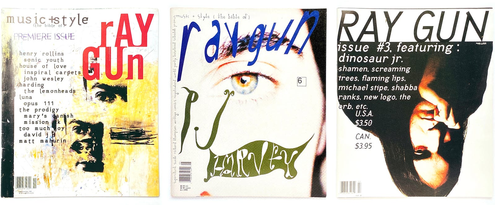
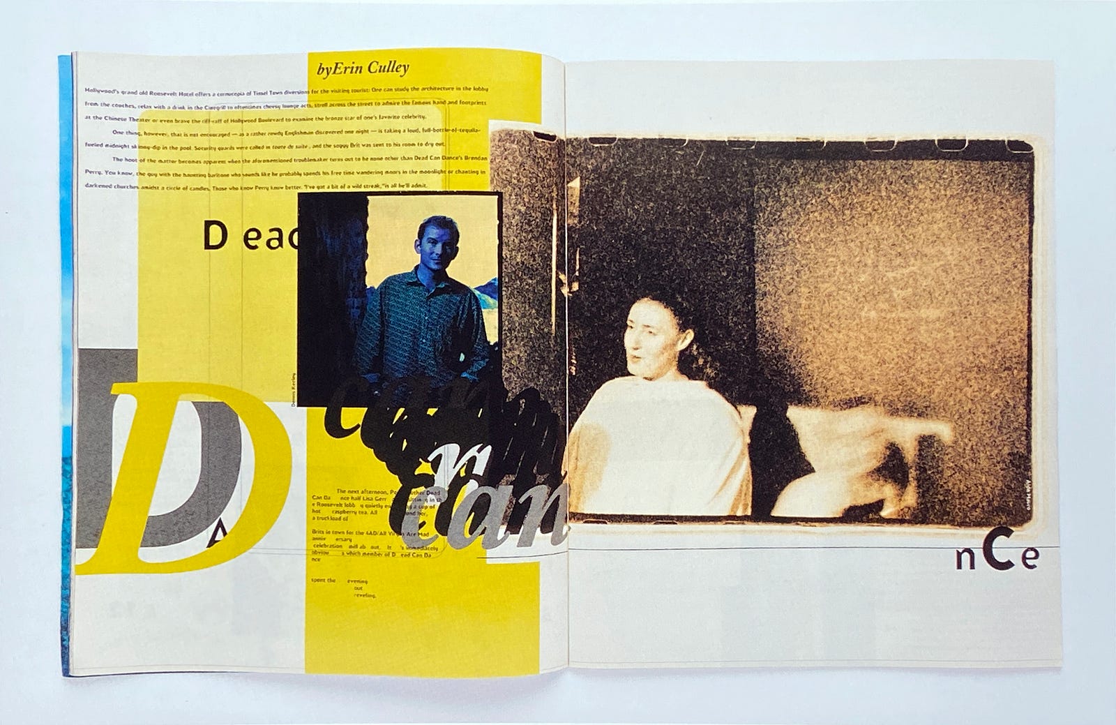
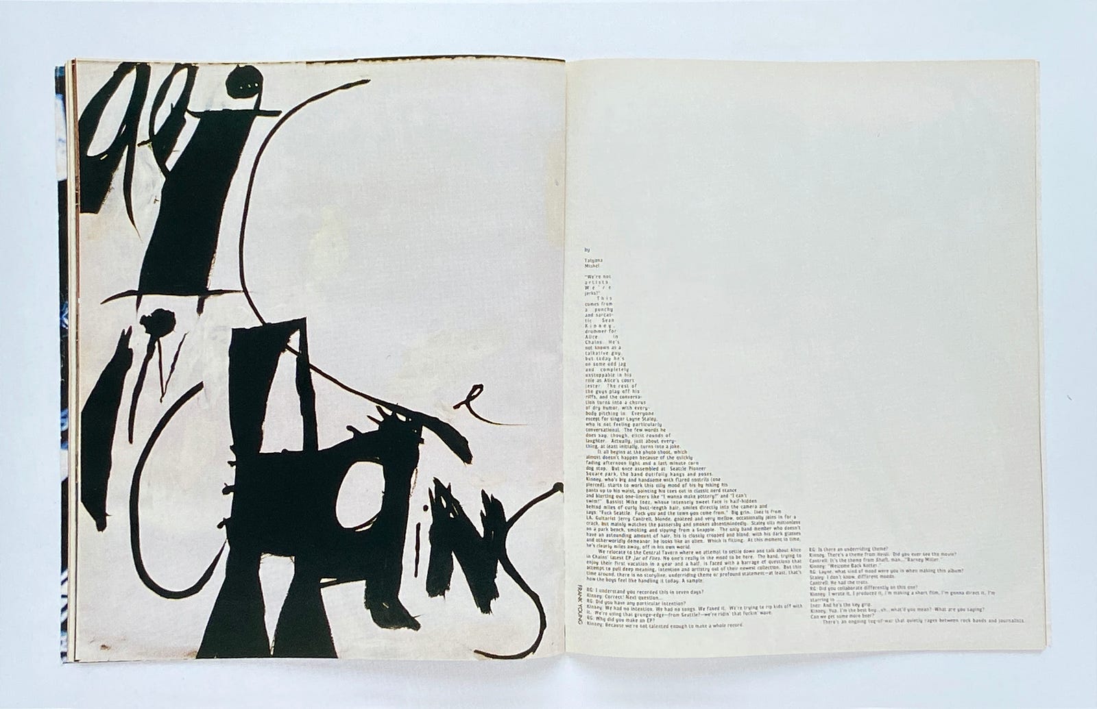
The pages of Ray Gun offered sensory overload — filled with shredded typography and ripped images swirling in and around every spread. Sometimes the design was intimidating, but it could also be a daring invitation to engage and discover. Most delightful to me was the feeling that the pages had been made by hand, which was ironic, since Ray Gun was first published during the dawn of desktop publishing. While so many magazines were suddenly beginning to look alike, Ray Gun was irreverent and exhilarating.
As I’ve written elsewhere, our proclivity for order and meaning can be overwhelmed by the inevitable chaos. But while chaos may be unsettling and disturbing, it is not without its own beauty.
The advent of New Wave typography
During the pandemic, I’ve been incessantly curious about this tension between order and chaos. The historian Henry Adams — no stranger to tragedy — once wrote: “Chaos was the law of nature; Order was the dream of man.” Having lost a wife to suicide, Adams knew of what he spoke.
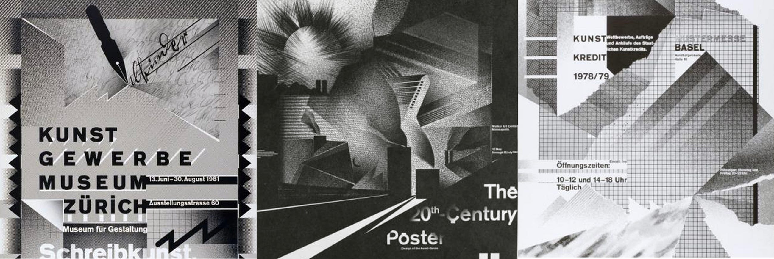
Although I was genuinely and delightfully startled by the design of Ray Gun magazine, it was a few years earlier during my design education that I was first introduced to postmodernism and what became known as New Wave typography.
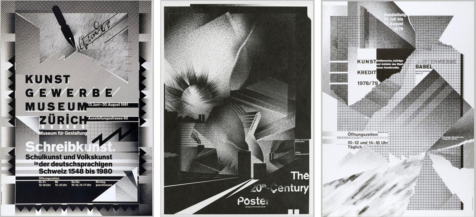
It seems like yesterday, but it was in 1984 that the designer and educator Wolfgang Weingart guest-lectured at my art school. Weingart was from the Basel School of Design in Switzerland, and as a young devotee of Swiss Design, I thought I knew something about the latest trends in typography. Apparently, I did not.
I remember sitting in the dark auditorium, trying to decipher his German accent, while his slideshow presentation blew my modernist mind. His designs were like nothing I had seen before — brash, energetic, and chaotic.
Up to this moment my design education was largely influenced by an earlier generation of Swiss designers, especially Armin Hoffman and Emil Ruder. But before me stood a person who was once their student, then their peer as an educator, and now a successor to their influence on graphic design.
It was during the turbulent 1960s that Weingart began to question the formalism of Swiss Design. He came to believe that new life needed to be breathed into typography and design. But how?
Having grown up in the rubble of postwar Europe and the ruin of modernist ideologies, he was especially discouraged by “the indifference displayed in daily life.” Of this time he wrote, “the young people of my generation were irreconcilable and unrelenting in their quest to redefine the ideals of our society. Many believed it would take a violent countermovement to effect change.” As in the United States, students across Europe became restless and protested for revolution. Underground flyers were hastily designed, printed, and distributed around campuses and gave Weingart the inspiration he sought:
“The typography was snipped out, pasted down and quick-printed. It signaled that a fresh, exciting new era was brewing out of authentic creative motivation and not out of aesthetic formalism.
Using magazine or newspaper print, they cut away unimportant words or letters and emphasized their new message with bold underlines. Type running diagonally across the page, from bottom to top, positioned in a circle, in many styles, in every size, and in any combination that communicated what there was to say, led to an expression that reinvented typography.”
Weingart would later go on to say that his radical departure from formalism respected the traditions and philosophies of Swiss Design, but he has often been quoted as asking: “What’s the use of being legible, when nothing inspires you to take notice of it?”
Looking back, I realize that I first studied graphic design at a remarkable time in history. During the early 80s, Swiss Design, which had so influenced and dominated graphic design, was beginning to recede. What began to cascade into my classrooms was what the cool kids called postmodernism.
Although the term postmodernism may be most directly applicable to architecture, it may also be applied to the divergent graphic design movements that emerged in reaction to modernism. Of those movements, it was the design and teaching of Wolfgang Weingart that became known as New Wave typography.
The energizing beauty of New Wave typography was invigorating, but as a design student I felt that it was also overwhelming. I decided to learn to walk before trying to run. I put postmodernism aside, as did many of my classmates, and began to focus on the influence of modern design. It was only some time later, while still a young magazine art director, that Ray Gun first jostled my Swiss sensibilities and reawakened my astonishment at the deconstructed world of postmodernism.
Chaos at the center
Even today, thumbing through the pages of Ray Gun is gratifying because I can see afresh the beauty amidst so much chaos. While Ray Gun first shoved aside my presuppositions about order, it was another music magazine that knocked the air out of my lungs. It was Rolling Stone, and it was breathtaking.
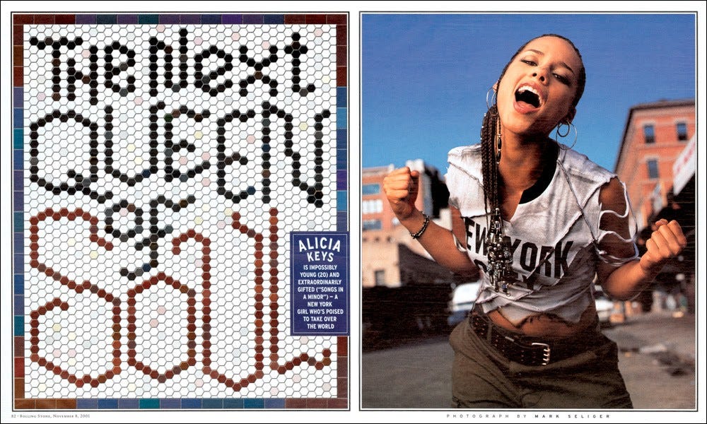
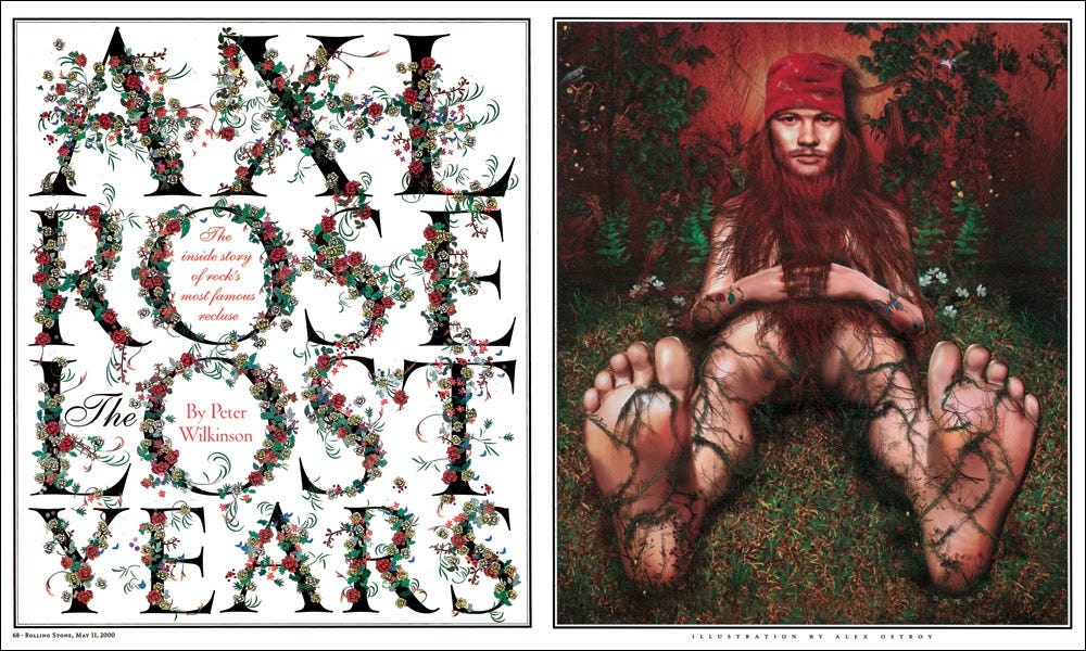
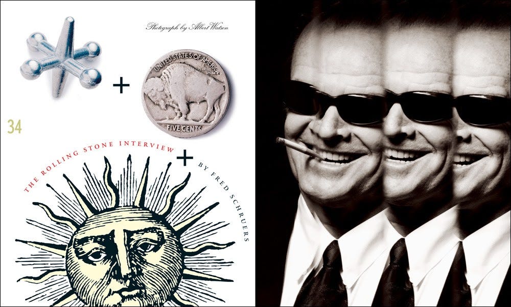
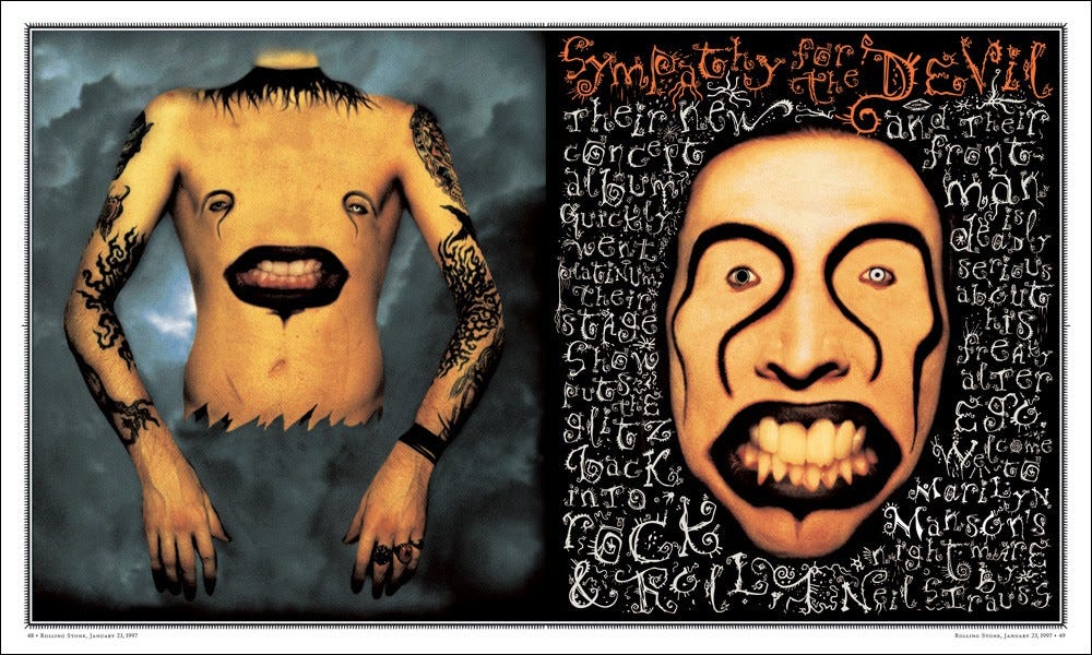
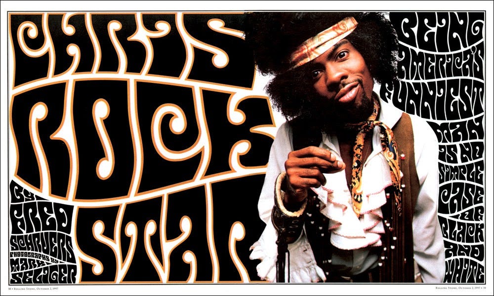
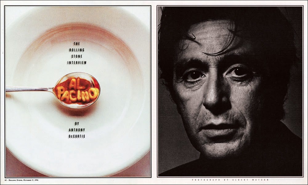
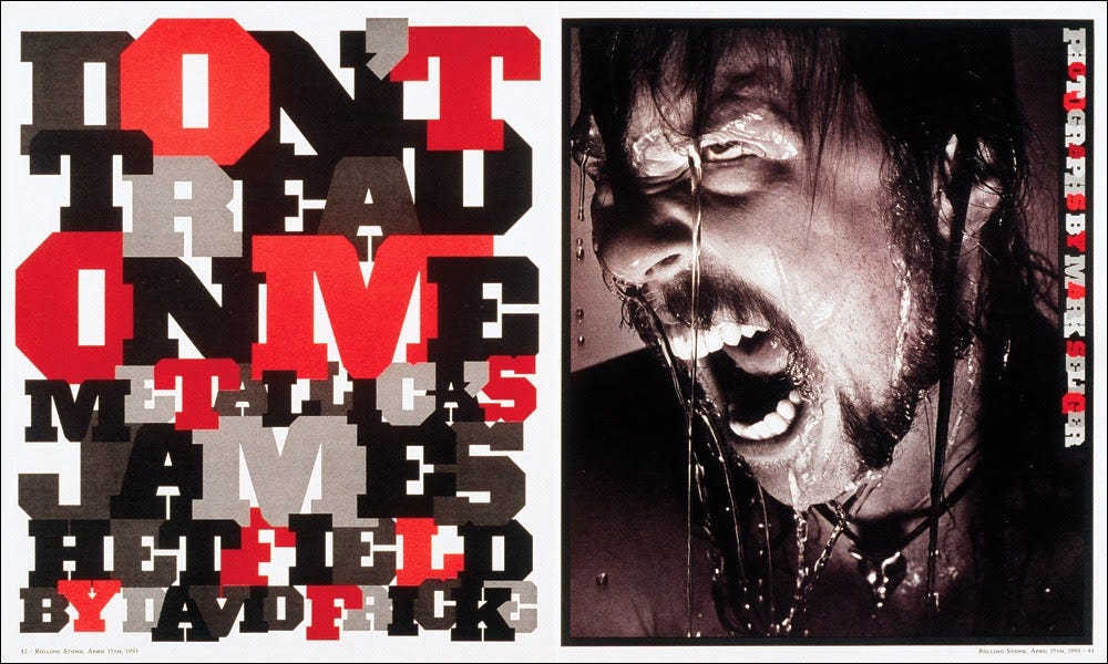
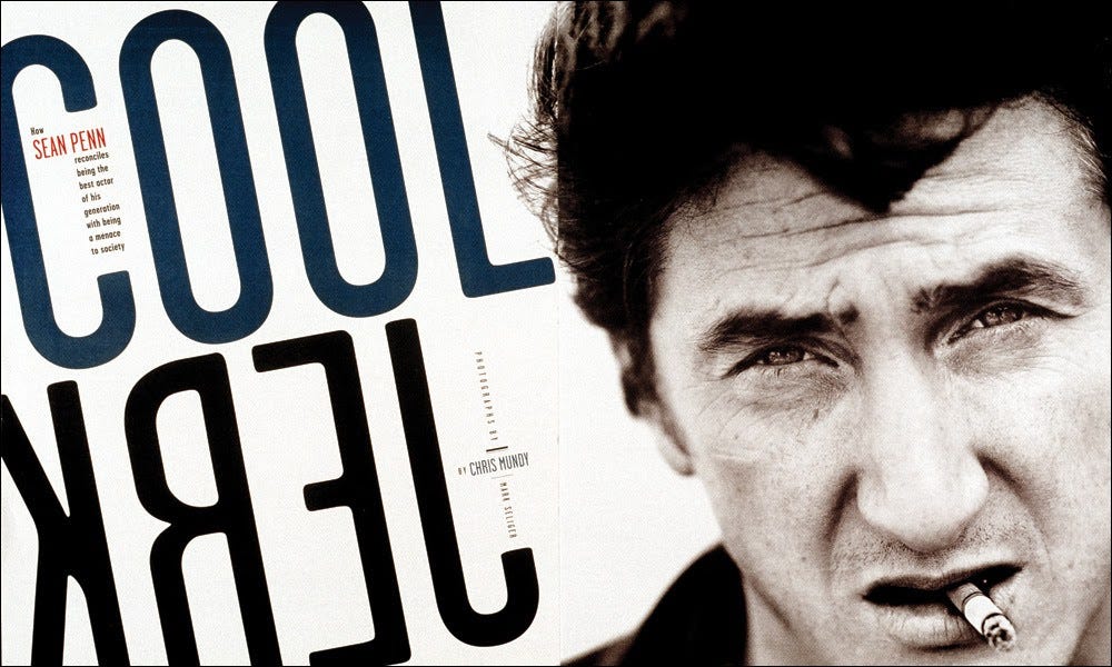
As a magazine born out of the chaotic 1960s, Rolling Stone has long been renowned for its journalism on music, politics, and culture. It also has a rich history of creating stunning imagery, especially of celebrity portraiture. But it was in the late 1980s and throughout the 1990s that Rolling Stone became one of the best designed magazines in the world.
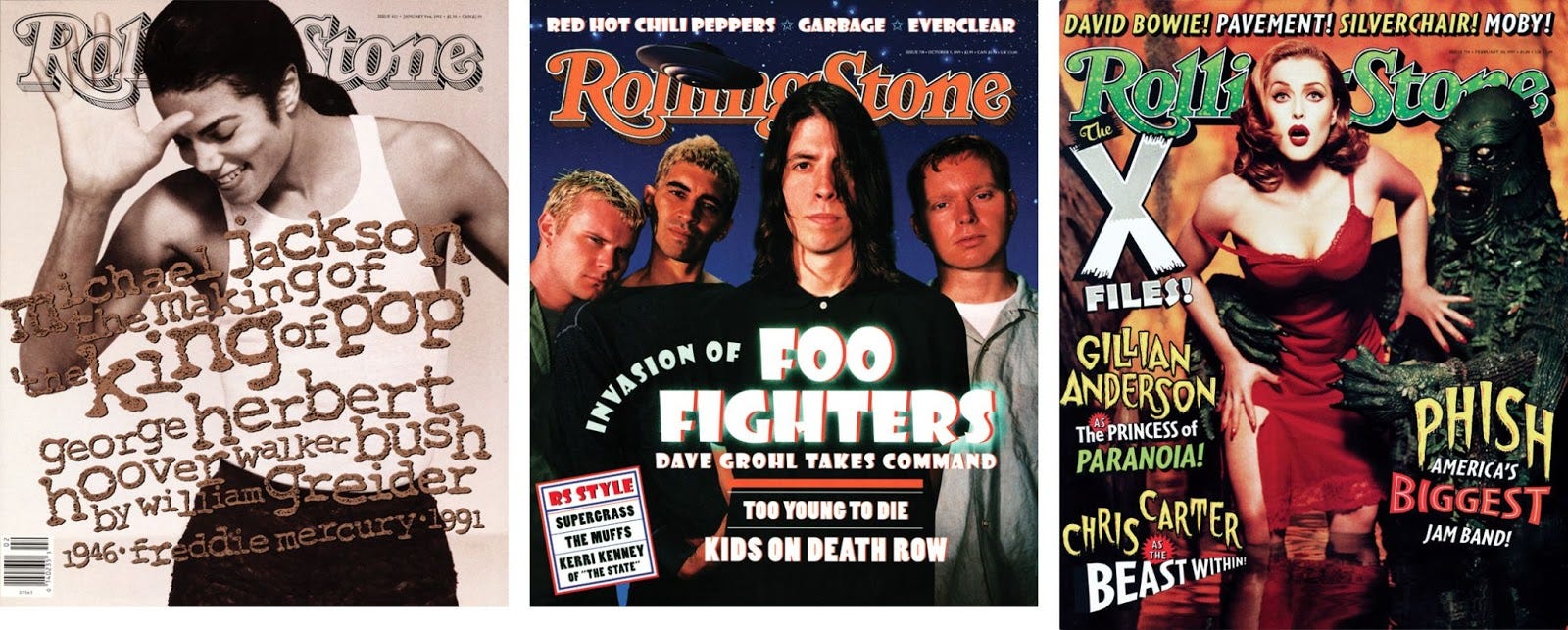
In an extraordinary collaboration, art director Fred Woodward and designer Gail Anderson seemed to make each other better while making the design great. While much of the magazine’s innovative design can be attributed to their creative alchemy, I wonder if some of the magic could be attributed to the imaginative ways they embraced order and chaos.
It might be said, for instance, that the magazine was structurally conventional, with identifiable departments and features, along with the visual wayfinding readers have come to expect. What’s more, the magazine had a distinctive look and feel — issue to issue, year to year — so that you always knew you were in the pages of Rolling Stone.
But while a backdrop of order held the design together, the chaos held center stage. To be clear, as these examples demonstrate, it was not that the design was visually incoherent, but that the layouts were fresh and surprising and invigorating. Every feature created a sense of wonder; the typography, design, and images worked together to upend expectations of what might happen next.
The past is prologue
It’s no accident that much of the most innovative design of the ironic 90s was created in progressive music magazines, especially alternative and mainstream rock. Where else could chaos be so fervently embraced? Perhaps musicians know, as do many visual artists, what it’s like to make meaning and find beauty amidst the pain and suffering.
The comedian Steve Martin once said, “Chaos in the midst of chaos isn’t funny, but chaos in the midst of order is.” Although he was speaking of comedy, his statement also resonates in the world of design. While clarity in design is imperative, sometimes it’s OK to put the cookies on the top shelf. Sometimes it’s OK to invite our audiences to reach a little. Their effort can reward them delight.
The magazines from the 1960s taught me the importance of order in graphic design. Some 30 years later the magazines of the 1990s enticed me to see beauty that only chaos can uncover.
That was almost 30 years ago. Where does the tension between order and chaos take us today?
