Maybe we can blame it all on Game of Thrones, but dragons have enjoyed a particular cultural renaissance of late. Whatever the reason, the fantastical fire-breathing beasts seem to increasingly fly through our popular imagination in film, television, games and books.
The U.S. Postal Service caught wind of this trend, and I had the privilege of serving as the art director for the 2018 Dragons stamps. I’ve served as an art director for USPS for the past seven years, and this role allows me to cross paths and cultivate relationships with some of America’s most talented artists. As an art director, I get to shepherd the design process of stamp creation and partner with creators, illustrators and designers across the country.
When the Citizens’ Stamp Advisory Committee, the body that selects subjects for future stamp issuances, decided on the topic of dragons, I was delighted to play a part in bringing these stamps to life.
Art directing the Dragons stamps
As I pondered the legendary appeal of dragons and how to translate them to the tiny canvas of a postage stamp, Mike Ryan, creative director at Journey Group, suggested a brilliant illustrator: Don Clark of Invisible Creature.
Don has worked with major brands and artists, with everyone from Target to Kendrick Lamar, and his bold, distinctive style was the perfect fit for a fresh, 21st-century take on the mythological creatures.
We began working together and sharing ideas, driven by the challenge to create a new depiction of dragons — and not rely too heavily on the plethora of existing images of the mythical creatures. We wanted the stamps to be simultaneously recognizable and yet completely new at the same time.


“I wanted to come up with something very graphic,” Don said. “When we think of dragons, we think of Dungeons & Dragons or darker paintings. It’s beautiful stuff, but for the stamps, we discussed doing something much more modern, graphic and colorful — an approach that we hadn’t necessarily seen before with dragons.”
As a result of his research process and design thinking, Don pitched four categories to broadly represent dragons: a traditional, medieval-era dragon; a dragon inspired by East Asian cultures; a sea dragon; and a fairy-tale dragon. I encouraged him to use the entire stamp canvas in his designs; I wanted to see dragons curling around and expressing a level of detail and intricacy to make them texturally interesting on such a small scale. These four categories led the way to the four final stamps, each presented on a narrow vertical canvas.


Don’s consummate artistry brought a particular magic to the stamps.
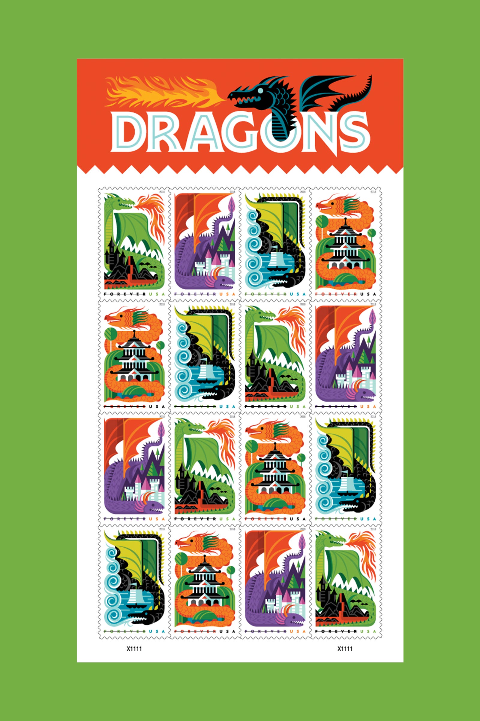
“My favorite part of this project was using the constraints to construct the composition,” he said. “With dragons, that’s not an easy thing, because there’s a lot going on, but the challenge was a lot of fun.”
Creating a dragon-driven product
Upstairs from my office at Journey Group, our print studio was also pondering dragons.
A long-term design partnership with the U.S. Postal Service has led Journey Group to design an array of postal projects. This year, USPS asked our team to come up with an inventive collectible product to celebrate the release of the Dragons stamps.

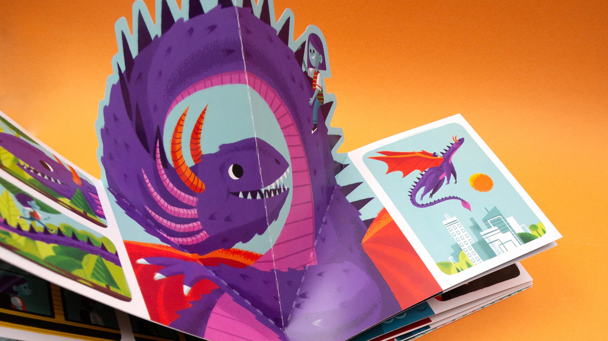
The print studio team pitched the idea of a pop-up book and a dragon-centric story to appeal to all ages. The printing technology would create an exciting visual and tactile experience, and a narrative around the four dragons stamps would draw readers into the wider world that inspired Don Clark’s designs. Thankfully, Don, with his extensive experience illustrating beautiful children’s books, was up for the additional design challenge.
Journey Group pitched the idea of a book that would be wordless, inviting readers to make up their own storyline and dialogue with each exciting page. To direct Don, however, Journey Group’s content strategist wrote a story about a little girl in the city who dreams of dragons and goes on adventures with each of the four dragons from the stamp designs.
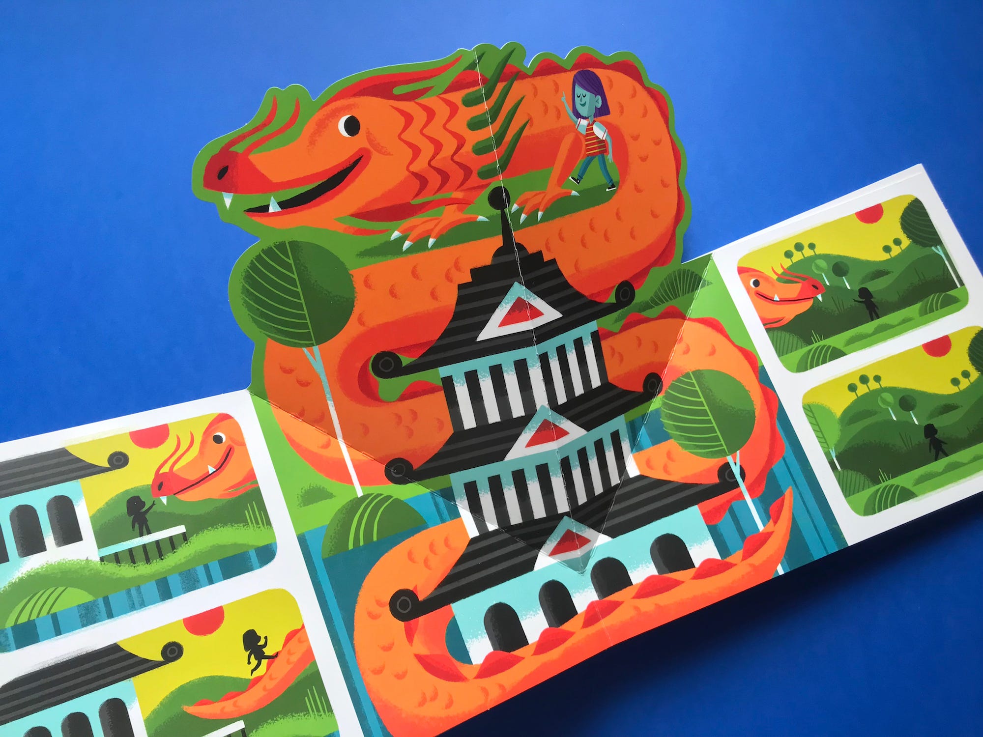
“I have never done a pop-up book before, so that was a cool challenge,” Don said. “One of the other challenges was taking the clean, modern aesthetic of the stamps and taking them in a painterly direction for the book. I wanted to make sure that the book was a nice complement to the stamps.”
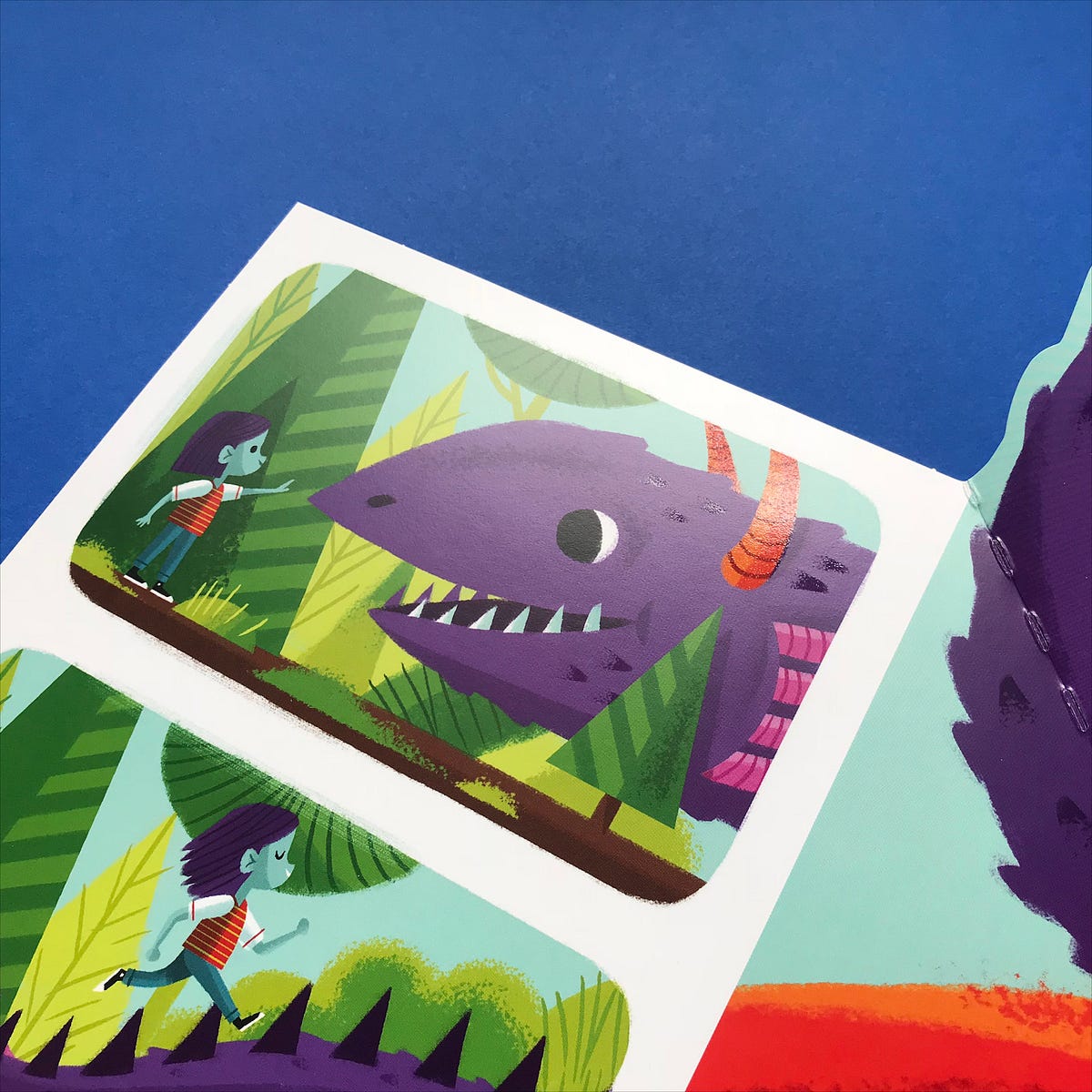
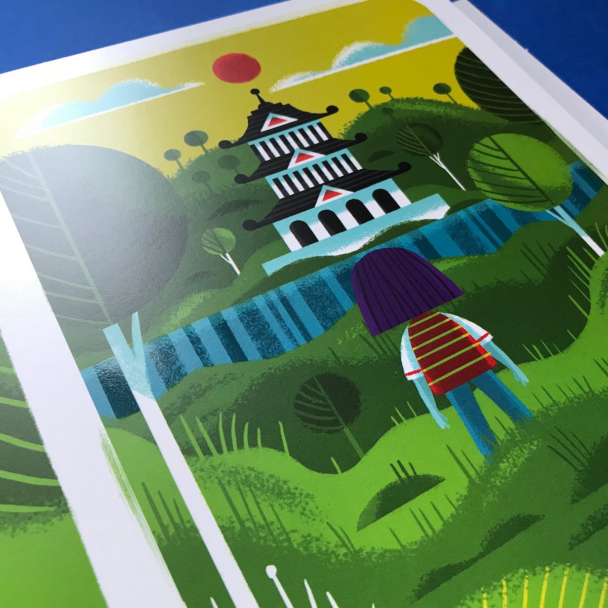
Working in a similar palette to the stamps and applying his distinctive style, Don brought the storyline to life in the charming final book, Dreaming With Dragons. “I enjoyed the challenge of taking the story we had read internally and then working to make it understandable to kids or to anyone who read the book,” he said. “It was really fun. As you would with a comic strip, I loved trying to figure out how to tell a story simply, without relying on language.”
Special varnishes were applied to the scales on the dragons throughout the book, adding an extra layer of visual charm and amplifying the creatures as the focus of the story. Journey Group worked with the John Roberts Company for the printing techniques for the book and its pop-up capability.
