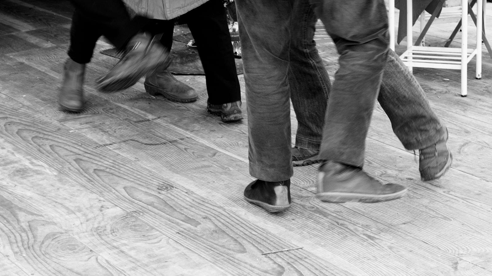
Although it seems absurd now, only a few weeks before we realized the coronavirus was already in our midst, my wife and I began taking dance lessons. We decided to learn country Western two-step because it was supposed to be simple and was supposed to be versatile enough to dance with a wide variety of music. We were wrong on both counts.
Much of popular music — so I am told — is in 4/4 time, but the two-step is measured in six-beat intervals. Our instructor tells us not to worry, that even ballroom dancing is measured in six beats. This is hardly helpful. A trickle of sweat rolls down my forehead.
On this first night, we were taught right away the basic cadence — quick / quick / s l o w / s l o w — so that each of the slows are actually two beats making for a cumulative six beats. I imagine this might be simple for many, but I am not particularly good at math, especially when my feet are involved.
What made this first unpleasant class even more awkward was that we all knew social distancing was about to become the worldwide norm. It was like the last night on earth when humans were allowed to touch each other, even though doing so assured our inevitable doom. Middle school cooties had nothing on us.
You think you’re going to learn to dance with your wife, but no, even though you’ve paid a lot of money for this misery, you are also expected to rotate and dance with every other woman in the class. I don’t like to dance with other women when the world is not spiraling out of control, but now that every new dance partner potentially exposes me to the ravages of COVID-19, I am now both an introvert and a germaphobe.
But I danced. And I smiled. But I did not make eye contact.
“Rhythm is something you either have or don’t have, but when you have it, you have it all over.”
For two long hours I warily danced with women I did not know, all the while trying to count to six, with my feet shuffling in and out of time. After the trickle of sweat became a torrent, most all of us finally caught onto the basic rhythm — the glide of quick / quick / slow / slow as each couple made their way around the gym floor.
Although fleeting, there were moments when I could feel the rhythm, the visceral joy of experiencing my body in sync with the music. But then social distancing cancelled the rest of the dance lessons. Mixed emotions.
Harmony: Resonance and Dissonance
As a graphic designer, I’d like to think I’m already quite good at social distancing — and not simply because I can’t dance — but because creating tension within relationships is a fundamental design principle. I don’t mean within interpersonal relationships, of course, but the kinds of visual relationships that occur within a work of design.
How these visual relationships are structured overlaps enormously with musical ideas like consonance and dissonance, repetition and contrast, and tension and release. For instance, the term harmony is how we often describe things that go well together, especially musical sounds. When a sound is perceived as pleasing, we might say it has consonance. However, not all harmonies are consonant. For example, composers may purposefully infuse other qualities into their compositions to create tension. We refer to sounds that are harsh and unpleasant as having dissonance.
Consonance is most often associated with delight and pleasure, whereas dissonance relates to feelings of repulsiveness or uncomfortableness. Quite often dissonant harmonies make us wince. But sometimes, even in design, that’s quite the point.
Rhythm: Repetition and Contrast
Often music structure is articulated as a dialogue between repetition and contrast. This ternary form, sometimes referred to as song form, is a symmetrical structure most often represented by the letters A B A. The A introduces a musical idea, while the B represents a departure from that idea, and the final A represents a return to the familiar music, often with variations, originally heard in the opening of the piece.
This sense of rhythm — statement / departure / return — helps a work of design establish both order and variation. Like many principles of design, our normative experiences as humans expose us to endless aesthetic experiences of harmony and rhythm.
In designing visual relationships, these principles play out both subtly and boldly, from the elegant ways typographic letterforms respond to each other to the graphic interplay of images displayed in a digital experience.
In the figure below, the ABA structure is represented as a simple introduction in how rhythm can be achieved with basic forms — and with endless variation.

Even the grunge rocker Kurt Cobain recognized these ideas in his song, Verse Chorus Verse, where he mocks and bemoans the predictable structure of popular music. He’s quite right, but that’s only because much of popular music has lacked imagination. The principles are but the entrance to an endless labyrinth of original ideas.
Elaboration: Tension and Release
Few designers have navigated the labyrinth so extensively as Armin Hofmann, a colossus of Swiss graphic design and one of the formative influences of the International Typographic Style — the design movement that served as a confluence of the many tributaries of 20th-century modernism.
A pair of Armin Hofmann’s poster designs from 1959 and 1962, respectively, serve to illustrate a fundamental condition of graphic design: the simultaneity of tension and release. The principle of elaboration extends the musical ideas of harmony and rhythm toward a perception of resolution. As the inception of tension gives way to the gratification of release, there is both a deeply human response and one that creates a portal toward effective and meaningful communication.
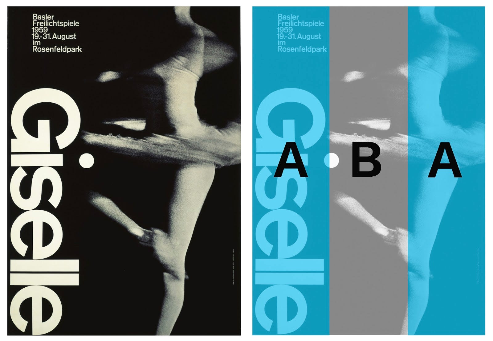
In this poster advertising the classical ballet, Giselle, the title of the performance runs down the left side of the poster making a visual statement. The mostly empty space in the middle provides a sense of departure, so that a sense of return is accomplished by the verticality of the dancer, whose form has been mimicked by the title.
While this ABA form provides structure to the poster as a whole, the parts elaborate the design further. For instance, the void in the middle of the composition is interrupted by the dancer’s body and costume, creating a sense of tension that is resolved by the larger rhythmic structure.
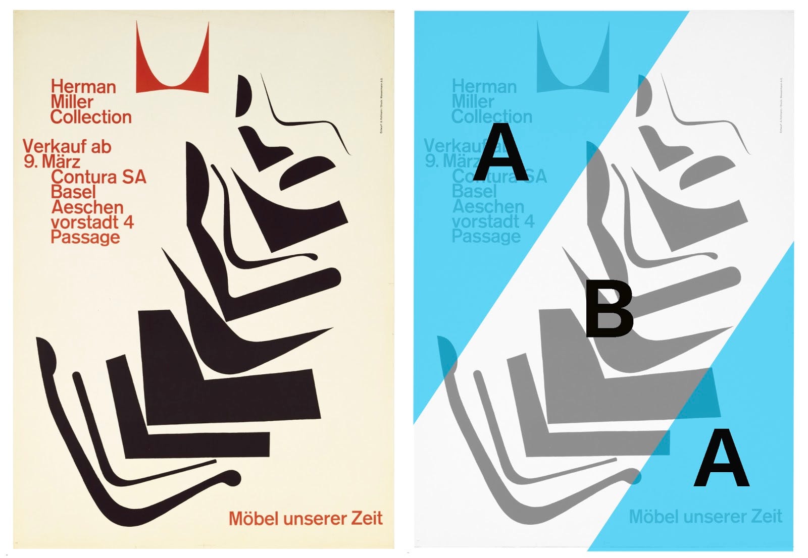
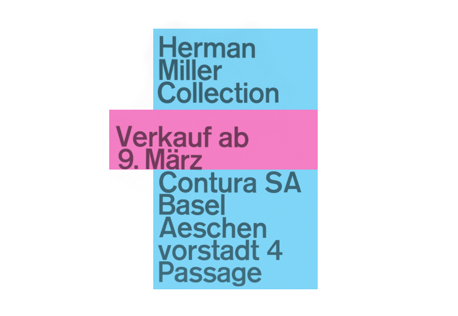
The essential structure of this Herman Miller sales poster also responds to ABA form, as illustrated above, by the introduction of a field of typography in the upper left, with a radical departure of dynamic form, only to be resolved by typography in the bottom right corner.
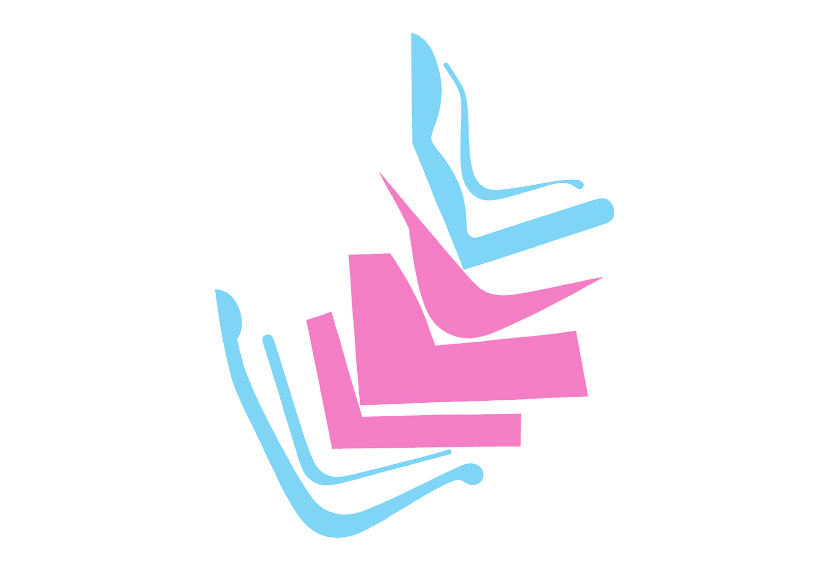
Furthermore, the design is elaborated by the dynamic arrangement of forms inspired by Herman Miller furniture design, which, upon inspection, also reveal details of ABA form. Hofmann created a sense of rhythm within the arrangement by alternating the visual weight of the forms.
Another subtle but interesting example of Hofmann’s use of ABA form can be found in the design of the typography in the upper left corner of the poster. What is at first a simple typographic column is disrupted by the jutting text toward the edge of the poster, creating the pattern of statement / departure / return.
Conclusion
Though social distancing is awkward, and never more than while learning to dance, the practice is instructive because we now have to be intentional about the space between us. Similarly, each of these principles — harmony, rhythm, and elaboration — help designers be more deliberate and purposeful in organizing visual space. They are quite simple, much like the basic steps in dance, but must be mastered to develop more engaging and innovative solutions.
As I type, my wife and I are confined at home, as is the rest of the world, waiting for the pandemic to taper off. One day, honky tonks everywhere will be open again — but not for me if I can’t get the basic rhythm down first.
Maybe someday soon we can pick up our dance lessons again. If I could only convert the smooth quick / quick / slow / slow rhythm to muscle memory, then we might be able to dip and spin and twirl.
Then, who knows? We may even be able to do the pretzel without injury.
